I’m a graduate student at Academy of Art University in SF, graduating this spring. If you have the time, your feedback would be incredibly helpful for me as I move forward applying to internships and jobs.
My current portfolio is mostly industrial design projects, but as I started out in graphic design and have heard through the grapevine that branding/logo skills are becoming more valuable in ID, I’ve opted to keep some GD projects in my portfolio as well. I’m not sure if this comes across as confusing or gives a sort of “jack of all master of none” vibe though.
The main questions I have are:
How do you think the projects are presenting now? What is confusing, where are there holes within the projects? Which are strong/weak?
What is missing from my portfolio as a whole?
Where do you think I should be spending my time in this final semester? Refining these projects, creating new ones, practicing/demonstrating a skillset?
Thanks so much for taking the time to review my work, the feedback I’ve been getting has really helped reshape how I view my portfolio and I’m looking forward to hearing from this group!
You have a strong presentation style. Your giff game is off the charts and it looks like you are using some 3D PDFs as well maybe?
I really enjoyed the Eau Claire rebranding. Nice work thinking through all the issues there.
The Nike Loam shoe is nice. The thinking is good, I think you could have pushed the aesthetic more and show more iterations and variation in the concept stage. One small question, you state the upper, midsole, and outsole materials. I think you should also specify the laces, and the adhesive. The adhesive is often the least green part of the shoe. Side note, I’ve noticed an uptick in people complaining to me about their shoes delaminating. I’m guessing this is related to companies switching to more water based adhesives.
I respect the craziness of the Stratos treadmill solution. It is a but bananas and makes me uneasy, but I don’t think that is necessarily bad for a concept project. The AR/VR glasses feel a but rushed and there doesn’t seem to be a formal relationship to the rest of the hardware. I think it would be good to connect them visually.
The Nasa watch is nice, but feels maybe a bit too familiar. I’d like to see you do something with more complex but controlled form somewhere in your portfolio.
Thanks for your thoughts! Not sure which part you were thinking of the 3D PDFs but I think I achieved what you saw through embeds from other websites mostly. Also thanks for noticing the gifs…those took way too much time.
I definitely agree about the Nike Loam shoe, I think I was a bit overly timid because I was unconfident at the time with my knowledge about footwear, footwear construction, and generally with how to approach the project. I’m in a footwear design class taught by Aaron Powers (for those that are unfamiliar, a recent Academy alumni and designer at Nike) and Aric Armon (footwear designer at Adidas). Their thoughts on the footwear design process, experimentation, and sketching process have been really helpful and I believe (cross my fingers) that the project I’m working on in that class will become a strong footwear project (we’ve been doing research up until this point in the semester but as we begin sketching and prototyping I’ll post progress). I’ll be taking a second pass at this soon.
I’ve waffled about the Stratos project for a while, mostly in its lack of communicating to others how it functions and the unrefined 3D model. I think I’ve figured out how to animate it in Keyshot, so that will help. I also intend to go back and do another detailing pass, as well as remodeling the camera drone. The AR/VR glasses were meant to be a generic pair (they were actually a modified Google Glass 3D model) but since that’s not reading too well I’ll model a pair of my own that fits into the Stratos aesthetic.
Do you think the NASA watch is still worth saving? I had intentions of remodeling it and updating the face a bit, adding a better modeled watch band, and generally flushing out the details a bit. If it’s feeling a bit dated I totally get that too and have some projects on the back burner that I’ve been tossing around.
Thanks again for taking the time to look at my work and send me your thoughts! I’ll get on making those alterations.
Ah I responded in the welcome thread as well. I definitely got the jack of all trades vibe from your portfolio, because you are going in depth into different realms of design while usually someone focuses on one. Being very visually oriented, I advise for your last project it to be less blue sky/outer space but more embedded in society, as a result of a conversation with collaboration partner(s).
For the Nasa watch project, it would be fantastic to hear their upper management’s thoughts on it. The watch feels generic and while beautiful and unisex did lose some of the aesthetic from your earlier sketches. Definitely a keeper for the portfolio though.
The robotic arm running concept is not necessarily what robots are good at, plus the trust and acceptance factors are paramount. I was hoping that you developed the AR system because with the right body-conforming hardware that may work. The hardware can even be a training tool itself if it helps keeping the hips steady.
For a graduation project, it all starts with a theme and working it to exhaustion. It took me six months even to find something when I was graduating. You can always post some proposals here.
Thanks for going through my portfolio! I agree with everything you said, especially on these last projects being more grounded.
I have a connection at NASA so I’ll see if he can help me find someone who can give me their feedback. If I can’t get anyone connected to the astronaut/ISS program, I’ll go forward with whoever I can get.
When you say AR system and body-conforming hardware, are you mostly thinking of a wearable that helps track your movements? Right now the proposal is that motion tracking technology via depth-sensing cameras/infrared would be enough in 10-20 years, but that is purely speculative. This whole project is much more blue sky than I’m used to so verifying its logic has been tricky at times.
So the grad project subject is a bit weird for me, the Summ Furniture project is actually my thesis but while on the surface it is furniture, I’m actually much more interested in the problem-solving and logic behind it. I spent a semester finding an idea, and that idea was essentially to design a product that was meant to age and gain imperfections as it went (a very broad topic). I went into furniture because it was a category in which my research showed people were interested in products that gained those attributes. There was a ton more testing of ideas, joinery testing, etc. that I’m working on organizing for my final presentation.
The only problem is that I’m not interested in furniture I made the choice to work on this project when I thought I was, but have found that it’s not the field for me. So I’m hoping to sell this project on its problem solving, prototyping process, and user research (almost all of which is currently missing from my online portfolio, but it’s good to know that adding it will help fill that void a little bit).
Takeaways:
Add in additional feedback from users, especially NASA higher ups
Potentially revisit NASA watch after feedback to push aesthetics
Focus final projects on user feedback and collaboration, making sure it is derived from society
Final project shouldn’t be too blue sky oriented
Questions:
How focused would you suggest making my portfolio? I’m interested in working in many different areas and have found it difficult to choose projects that are consistently in one area, but I know that being too scattered makes viewers confused…
Thanks again for taking the time to go through my work and send me your thoughts!
I’m wondering if it’s better to take away the photography section from the landing page. This is the first page I’m on with 9 projects in view at the same time. While quantity is great, I think that could contribute to the “jack of all trades” thought. It’s not just quantity in product categories, but quantity in creative topics. So there’s ID, GD, Photography, and Sculpture (because you called it experiments, that was my first impression before viewing that page). I do think the experiments page could be better elaborated on. The woodworking projects look great and I’d be interested to know what inspired them or what you learned from doing them.
Even through ID projects, it’s very clear when someone has a graphic design sensibility and a good eye for composition and lighting. These photography elements could be shown through your renderings and product shots for instance. Having additional projects like Photography mixed in could add additional viewing time that could dilute whatever understanding others have of your core ID capabilities. Maybe they’re better viewed through another navigation menu, kind of like how you separated GD and ID.
Also, imagine if someone is very impressed by your NASA watch project because they can empathize with how important space exploration is for the development of humankind and would totally support the cause by wearing a slick watch. And then they see a cute cat picture and click on it to see a sudden flickr-esque page of cute animals. I also didn’t see any product photography here. Having that would 100% tie this back to being an ID portfolio.
I think one of the biggest challenges in curating a portfolio is realizing what might be filler or not helping with elevating people’s perception of you as a strong industrial designer. The downfall about a website is that it’s hard to control what pages people click on. Obviously with a .pdf it’s just scrolling forward and backward, but with a website, everything is fair game. You can definitely influence this viewing experience though. For example, maybe the thumbnails are bigger and kicks down the least 3 ID projects. People can scroll down to see more and would have likely already viewed the more impactful projects first.
I think you’re good on breadth of work. For your next project(s), I’d suggest to really consider where you want to work at and gear your projects and portfolio to those places. You need to have a stronger focus and a clear voice.
I think you’re right about the photography being unneeded on the front page. I was thinking of trying to show some of my personality, snippets into my life, etc. but I don’t think that’s working right now, and definitely doesn’t need to be on the main page. Maybe I’ll rename that section something else…“free time” or simply “other stuff.” Worst case I remove them so I don’t have that distraction.
The thesis I’m working on now should have an opportunity for some good product shots, so I’ll make sure I nail those and incorporate them.
Are there any projects that feel like filler right now? I have my suspicions but I’d like to hear what you think.
As for the next projects, I’m working on a footwear project because I’m actually getting very interested in performance footwear. My portfolio right now is definitely more directed towards a consultancy, but I’m hoping I can still leverage those projects as I apply to footwear internships (I’ve also been applying to consultancy internships for the past several months).
Thanks again for the feedback, it’s really helpful!
Glad my rambling is helping a bit. Well, it’s hard to say your branding projects are filler because I definitely enjoy your logo explorations. It’s an interesting challenge to find the core essence of complex forms like finger prints and visualize it in a simple and communicative logo. This way of thinking definitely translates to industrial design.
I think these projects could be reframed a bit so that they show the same considerations seen in industrial design work. For Fjord, explain the packaging and marketing material. What is Scandinavian about these designs? How distinct would the packaging look on the shelf? Who are the consumers and what does the brand/company stand for? How is that communicated through the aesthetic and material choices? What is the brand experience? Just some questions I thought of on the fly.
The athletic logo redesign isn’t doing much for me, but I can see it being very relevant for applying to footwear. It’s a weaker project because of how logo-design oriented it is. I see more logo iterations than how it’s applied. So if you have a footwear product designed, then you can probably ditch this one. Otherwise, try elevating the presentation style and show more of your understanding of sports and what it represents. Look at how footwear companies work their advertising. It’s very dynamic and confident. If you can mimic that energy in pages like your logo exploration layout and “The New Blu” logo tee application, that would help immensely with showing how you understand what sports embody and how it’s marketed to consumers.
This is all my opinion of course, so please take what is applicable!
Absolutely, definitely helping! I was thinking about what you said earlier today and was also considering eliminating the dedicated graphic design projects entirely once I elevate the branding of some of my other projects.
Thanks for pointing out that the Eau Claire Athletics project doesn’t look very dynamic or “sport-y.” In hindsight that was because I was working for the University and was working within their guidelines. Kind of forgot that most people outside of the school wouldn’t have that reference. Now that I’m not working there anymore I’ll definitely update the graphic style to be more exciting and relevant.
So my overall takeaways:
Get more focused: remove portraits from front page
Reduce prominence of branding/logo work
Reframe graphic projects with objectives, users, and brand experience values
Raise level of graphics in other projects
Make sure renders show skills in the same way as photography
Overall think about guiding the viewer by showing best work first (and make sure there is no weak work)
Thanks again! I’ve already updated my home page and am working on some other changes as well.
Glad to see that those changes were quick and easy to implement, Josh! It felt refreshing to see the updated website. Good luck with the improvements.
Regarding the Stratos project, I think some visual context would help. It’s a treadmill for the home (assumed from your See The World glasses image), but it looks like laboratory/medical equipment to me. The nondescript figures (solid color, no clothing, no facial expressions) are further making this design look cold and unapproachable. I think you can use your research imagery in the beginning as inspiration for how to give that fitness feel to your product renders. For the Feel the Terrain visual, it’s ok to trace a runner or use a low-opacity BW image of one. The rough sketch is a jarring contrast against the clean product linework.
Went ahead and switched out that scribbly sketch for a vector and changed up one of the exploration pages to emphasize the 3D models, which in reality was where most of the exploration occurred. looking at it, still don’t love this vector but needed to make at least some change asap.
I’m starting to realize that this project really doesn’t show my understanding of running culture (I’ve been a part of the sport and competed at a pretty high level for over 12 years) so that’s a bit problematic. I think just like you mentioned with the Eau Claire athletics redesign, I didn’t show that I understand athletic culture and the dynamic energy that is associated with it.
Now that the 3D thumbnails are bigger, I’m curious what your thoughts are on the middle idea. It was my first direction I was pretty excited about but my instructor was adamant I go for a different aesthetic but looking back on it I still like the general “hubless” concept. Otherwise, do you think the other model could fit better with a CMF change and rendering treatment? I totally agree that right now it feels very medical. In fact, the whole project does
Will continue to work on the other projects, but Stratos felt like it was most pressingly in need of some work. While I rework the final 3D model, I’ve changed the intro to set the stage and give a better rubric to grade against later in the project.
I think that middle idea looks like it aesthetically fits in more with other running equipment. The black and defined chamfers help the treadmill look stronger. I agree with your professor about using a different aesthetic. Since your idea is a bit out there and unique, you might as well challenge the CMF trends in fitness equipment too. If you have stronger reasons for these CMF choices other than different, that’d be better. What will urban homes look like in 2050?
Good to hear that you are taking note of the feedback you are receiving - I would definitely like to see projects stemming more from needs that you have observed in people…in the end though, it is your portfolio.
It is more about conveying a certain profile of yourself - are you the one mainly coming up with the new ideas, doing the research, or collaborating with manufacturers to get the most out of the project? Are you inspired by people, art, technology etc? You definitely seem to have a strong affinity with design for sports but if that is the case, explicitly state that in your Design identity / About me section. People mostly want to have a gist of who you are.
If the furniture project was to show research and conceptualization skills, make that clear on the pages because it is very visually high-end in a ‘this is it, the final product’ vibe whereas a conceptual presentation needs more of an explorative feel to it as well as a purpose - what were you exploring and why, what worked best and how did you evaluate the quality of your concepts. I am sure people would love to see more of that project.
Yes when we see work like this, coaches / art directors have to prevent that a designer is going to climb up the wrong ladder so to speak.
Before working out a concept, it needs a proof of concept and proof of technology. Remote sensing is an opportunity but can also be a pitfall - it is computationally more fragile and often requires a more extensive software platform to run well (like Kinect) plus it is harder to detect more subtle motions, like what your hips are doing - unless you would require users to wear a marker suit of some kind. Therefore most companies step to on-body sensing which is far richer and computationally lightweight implementation. One or more simple stretch sensors can provide very reliable data for example in knee bending angles, back posture, breathing patterns. But mostly I am missing how the pads would stay linked to the foot position, and if they are attached to the feet, how will you retain the free, flowing feeling of running outdoors.
Have you tried AR platforms? I have a Windows Mixed Reality set and it is far different of course from Hololens AR, still overlaying a virtual world onto the physical one will tend to confuse the body and mind, so it seems a good way is to install some kind of brace to keep the body in position, or at least provide feedback by means of audio/vibrations. Research has been done in this for example in the context of snowboarders learning to keep balance, people with problems walking due to balance impairments, even billiard players learning to keep the cue in the right zone.
I think I’ll need to do deeper research into the future of human-robot coordination to try and find some proof of concepts to what I was thinking. The thoughts were mostly born out of runners’ needs, and they were pretty explicit in not wanting to be attached to anything (which became my goal, but may not be possible with the technology constraints). In this system it would be possible to fall off…which is true of most exercise equipment but I’m still not sure if it is an acceptable risk or not.
The risks with AR/mixed reality not playing well with a user’s inner ear definitely seems real. I haven’t gotten a chance to play with any AR headsets, but from the VR headsets I’ve used I can definitely see this being an issue. Maybe UX designers will find a way around it, but as of now I’m not sure what the solution is.
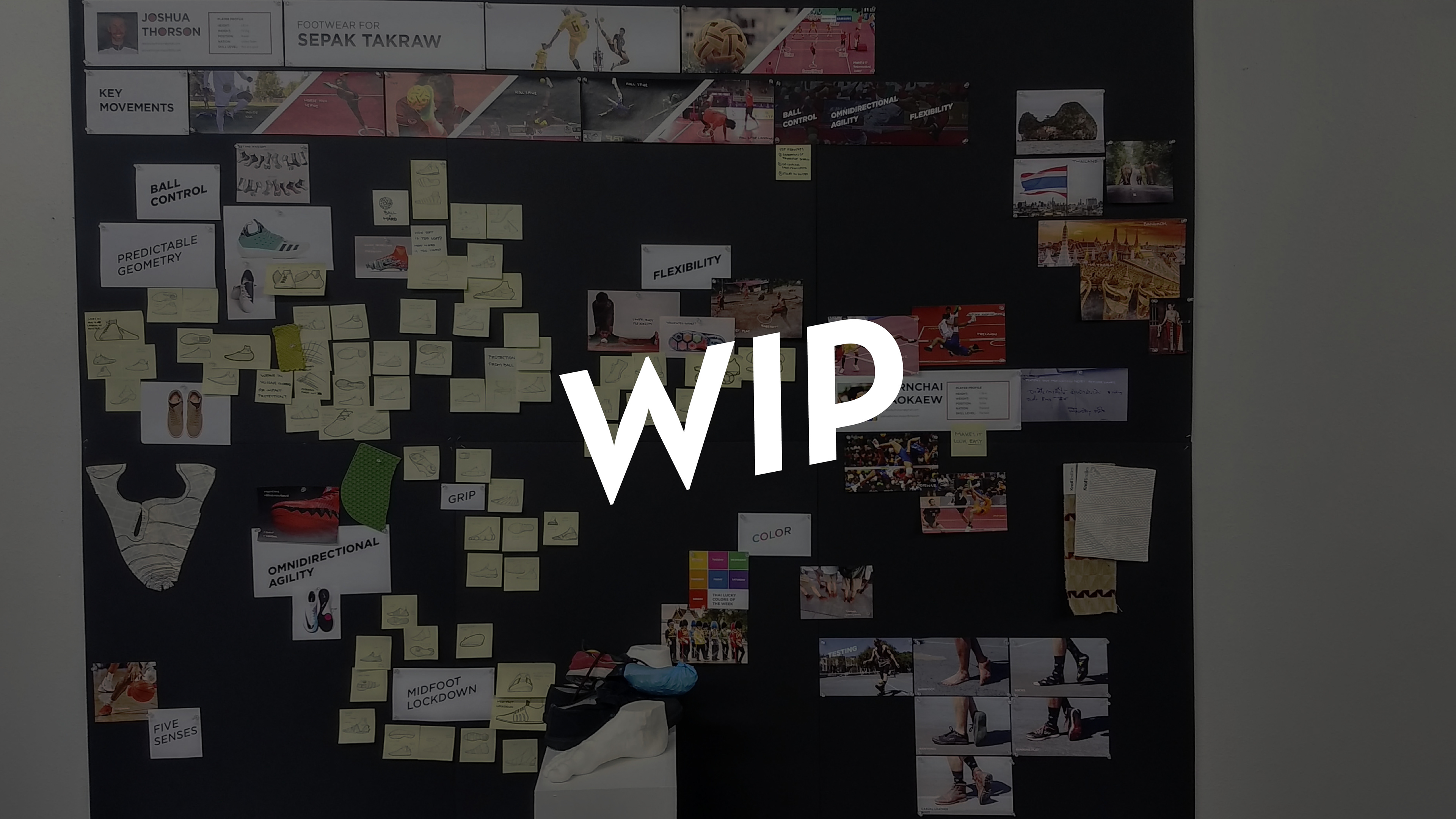
Good to hear about getting user feedback and insights on the future project. Here is the link to my next project, a shoe designed for sepak takraw. It is a sport that is mostly played in Southeast Asia that is similar to volleyball but played with your feet. Also, the ball is 5.5" in diameter and made of hard plastic, so it hurts.
I have some more interviews I haven’t included in my presentation so far, but this is where I am so far!
Hoping to hear general feedback, but also if there are any red flags popping out. Been having trouble getting any bites recently and hoping to find out if there’s anything specific I need to add/remove. I’m mostly applying to footwear positions, I’m extremely passionate about footwear innovation especially around performance running, but I’d also like to work for a consultancy that might be more sustainability or nonprofit-focused.
Most of the work I’ve done over the past 9ish months is under NDA (all footwear related). To add some fresh work to my portfolio I might do a nice form study since I rarely got to touch on those kinds of projects in school (ended up being much more invention-ish or at least innovation focused).
Anyway, thanks for stopping by! Here are a few previews:
Hey Josh,
I took an admittedly quick peek. Your digital skills seem strong and show well… lots of animation & interactive features gives your portfolio a unique/engaging feel. You have interesting ideas, even the ones (like the treadmill!) that are pretty out there. Generally, I think the end solutions are good too. I’m comfortable with your sense of style, creative thinking, presentation, and skills with Illustrator, Photoshop, CAD, etc.
BUT, if I were to suggest something to add—I would like to see more sketching. Maybe I’m biased because that’s what I generally look for at my company, but it seems like you have a lot of background then a final concept crops up fast. The furniture project is a cool idea, but what would some of the other shape options look like if you built furniture with them? Why was the final form selected? Similarly, the treadmill and the Taktic footware have sketches, but it feels a little light.
Again, it’s not that the end concepts are bad, I just think there’s some benefit to showing a little more sketching. It will showcase another skill set and illustrate (pun intended) that you can bang your head on a wall until you get the right idea. There’s no shame in back-filling portfolio work either. If you want to practice sketching, you can just replace old sketches as you make new ones or add new concepts that weren’t originally part of the mix. The portfolio is a chance to show off what you can do now. Keep at it though, you have a good base, I’m sure you’ll find something!
Hey Chris,
Thanks for the feedback! Totally agree on including more sketching, I tend to focus on the storytelling/insights to the detriment of including more sketches, I’ll go back in and add some more sketches (like you said, probably a mix of old and new) to help fill in some of the process.
The point about showing what the furniture would have looked like when made out of the other shape options seems like it would help answer some questions about my process.
One aspect I know I’m missing is a project that really shows a really refined 3D model, nice details, manufacturability, etc. Did you notice that or did you feel like it was a detriment at all?
Michael, thanks for taking the time to check it out!