Source: http://projectbluefoot.com
Check the PBF:Forums Official Lebron thread for more info: http://projectbluefoot.com/forums
Source: http://projectbluefoot.com
Check the PBF:Forums Official Lebron thread for more info: http://projectbluefoot.com/forums
Submit your LeBron James Basketball Concept NOW!
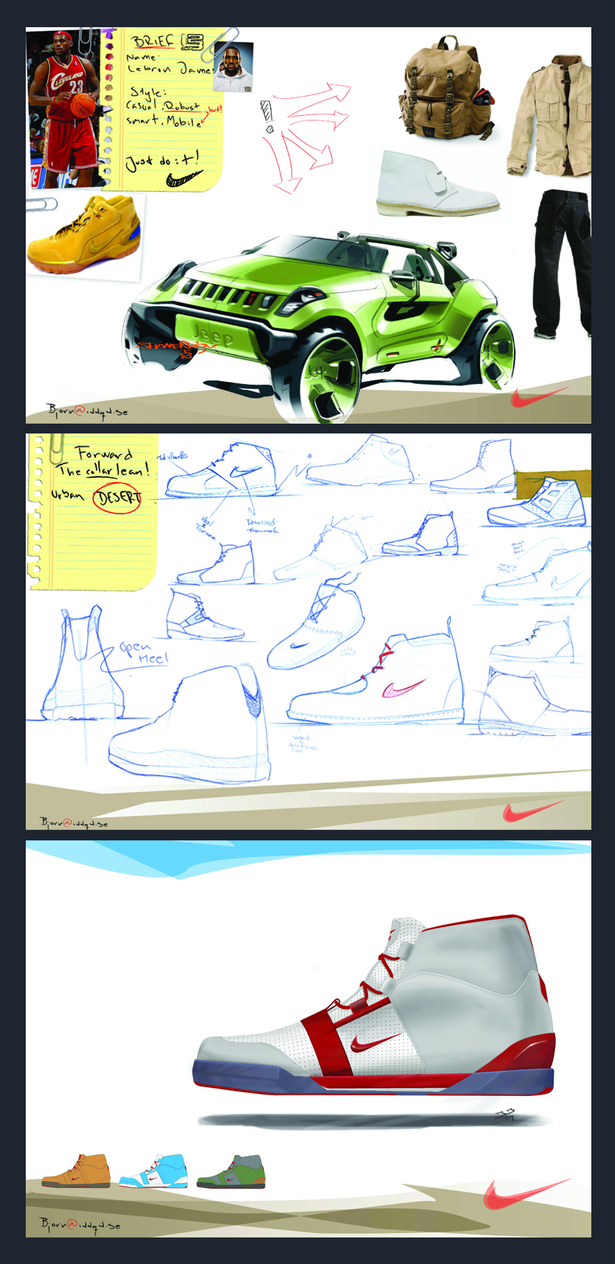
WITNESS. The ultimate global footwear design competition to create a performance basketball shoe for LeBron James. Time is ticking. Do you have what it takes to go the distance? Submit your sneaker concept now into Project Bluefoot’s latest star-studded design challenge. You only have until Oct. 15th, Midnight (PST) to enter. Do what it takes to win. WE ARE ALL WITNESSES…
Will the next one be non BB themed? I’d like to enter but I have no interest in basketball shoes ![]()
Agreed.
Although i love BB shoes, and it is the halo sport of shoe design. I think what Steez has setup is great and a good opportunity for designers young and old alike to get some work out there, but i dont think that even nike basketball wants kids that only focus on basketball shoes. A couple bb projects to get the sites momentum going is not a bad idea though, but I am definitely looking forward to seeing other sports, as well as non-athletic shoes.
I love BB shoes, but I think it would be better to have a non-LBJ competition. Maybe where you get to pick the player or style of play the shoe is for? I’ve seen way too many real and contest concept LBJ shoes, but maybe that’s just me.
We’ll be having a non-BB themed comp soon. We’ve been planning to switch up the categories all along, so that’s definitely covered. Also, we’re holding mini-comps like the “Lebron Lifestyle” where it’s specifically non-performance, so those are ones you should take a shot at too. Every month is partnered up directly with a company, so there’s a lot of work that goes into setting up a competition and getting it approved through all the channels.
If any of you here on Core77 work for a footwear company or related industry (apparel company, automobile company, video game company…WHATEVER!) that would be interested in hosting a comp with us, PLEASE speak up and drop me a line. Things get done MUCH faster when I don’t have to cold call marketing teams out of the blue to do these. I’m working overtime to make sure the designers entering these comps get maximum exposure for their work and hopefully break a few of you into the industry. So, to any of you out there reading this, let’s get something done!
My email: john.brilliant@projectbluefoot.com
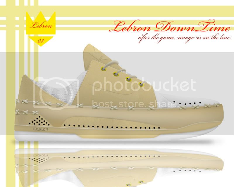
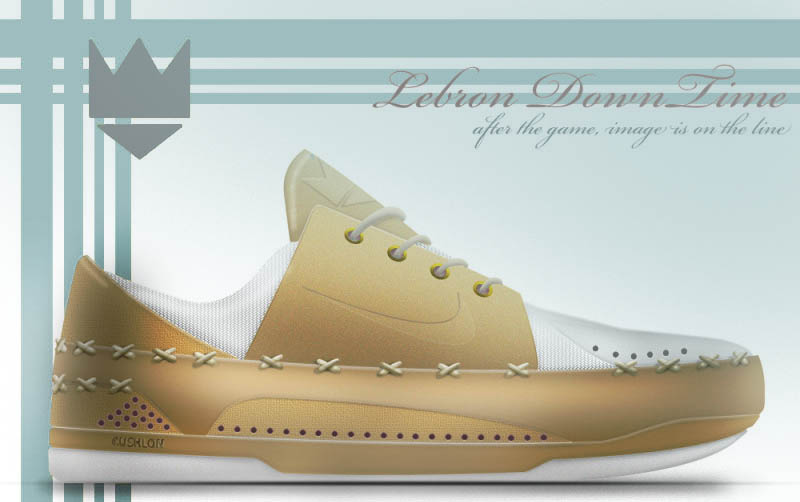
speaking of casual…here was my submission. i’d love some critique. be harsh if you need to be because that’s the only way i’ll get better. thanks in advance for any help you can provide.
StyleR_
First off, it’s great to see how much improvement you’ve made! Big steps! Nice details, and I like the sketch page a lot.
A few points: the following is just what I would do with it. Not necessarily “right”
Rendering: I spent 10 minutes implementing these so it makes more sense:
Design:
Keep up the good work. This is a very solid entry.
as always, thank you for the time you take to respond with help and advice, YO. i tried to use your advice and tips in my entry and i must admit, i didn’t realize something like contrast and proper color useage could make a huge difference.
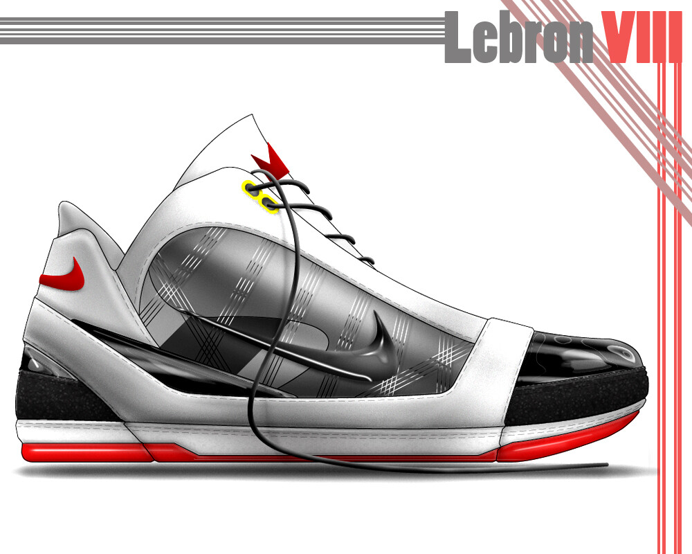
here’s what i turned in to the PBF design contest for the LBJVIII:
_The idea for my submission comes from the current trend that seems to be happening with Nike design. The term ‘retro’ has been around for a while, and can be a polarizing thing, especially in the world of sneakers. What I mean is that there will always be people who look back fondly at the timeless designs of decades passed and wish for more of the same, and there will always be a group who want to look forward to the future, pushing the boundaries further and further. It seems that few things can bring the two groups together.
Enter, Lebron James.
When Lebron James entered the league, he was immediately being compared to one of the NBA’s greatest point guards, ‘Magic’ Johnson. At the same time, he was heralded as the future star and dominant player. This expectation to be something from the past, and at the same time be a glimpse of the future, is where I get my inspiration.
The shoe has a deceivingly simplistic silhouette, reminiscent of the Nike Dunk or Air Force 1, but hidden within that retro-styling, are some of the most up-to-date technologies and materials to be placed on an athletic shoe.
In addition to giving a nod to the past while keeping our eyes on the future, I acknowledge his love for a certain aesthetic styling that can be traced back to his affinity for the Air Jordan XI. Whether it be a full patent leather panel, or toe caps, one cannot deny that his previous shoes have all had that ‘it-kind-of-looks-like-the-XI’ feel.
…that is Lebron James, and this is the LBJ8.
\
StyleR,
so did you submit both? or only the bottom one?
I submitted the first one to the casual shoe entry and the second one to the basketball.
Really like the bball entry there Styler and the improvements presentationwise, It just looks much cleaner and more professional. The red line graphics around the page could be toned down a bit I believe, but its not competing for the visual space half as much as the lifestyle layout.
It almost looks like it came from two different people. Good work!
The design gives me bit of a motorsport feeling. I do think its mainly due to the silver piece under the swoosh which makes it look pretty robust.
The render looks sweet and reads well. Spontaneously the only thing I think you could improve is that the heel looks a bit flat, so maybe just pump up the shading there a tad to make it wrap around more. Also tone down/fade the linework around the pieces a tad too, to make it look less like illustrator-art.
Its a shame that more people dont post their entries… Itd be fun to see more entries and discuss them.
and just to make my last statement legit.
Heres my lifestyle entry.
Compared to the jordan comp, i distributed more time to the initial research and inspiration, and a lot less to the render. Mainly because i really need to speed up my render times.
I feel like its not there yet, according to the inspiration and concept. But as soon as i get some time over ill make a couple of adjustments to make it fit the boot-theme better, especially the sculpting of the outsole. I also want to add a toedown and a outsole view.
thanks for the feedback. i always debate on whether to leave the lines showing, or leave them out. it really depends on how good a job i feel i did on the shading and adding volume to the linework. for the casual shoe, i felt that the form could stand well without having to rely on the lines imply form and shape. the basketball render was done to the best of my abilities as well, but i just thought the image ‘popped’ more if the lines stayed. it looks ‘cartoonish’ though, and but i guess that’s also a subjective opinion…we’re always hardest on our own work, right?
i saw your LBJ casual shoe entry on PBF and i really like the form and styling. it reminds me of the lavadome. i love the sketching too, and it’s something i should start doing more…especially the various angles and views, just to add more definition to the idea and flesh out the concept more for folks who can’t read my mind.
i’d love to see what everyone else submitted too. this site has always been a great resource because i can’t think of another place where professionals are so willing and available to drop that knowledge…it’s a shame not too many take advantage of it more.
styleR,
in reguards to your casual shoe, i agree with everything yo said. Also wanted to add that on your callout page, on “G”, i believe through the texture that you have given to the sole that what you want to use is Crepe rubber (not sticky gum)? As on the clarks wallaby’s and desert boots? Thats what its called.
Also, i like the handstiched detials you have on the rand running around the shoe but i would try to add some color burn marks (maybe a 12pt soft brush) to the leather so that it appears that the stitching is actually in the leather an not just sitting on top, which is kinda how it looks now. Also try to find some leather texture that matches what you envision it to be, in casual footwear the leather choice is important, i know you may not have a bunch of leather jpegs to use but try to find some, it will really give the shoe/render a richness if you use it right.
Also just some texture variation in general, i have a hard time determining where the outsole meets the midsole meets the upper since they are all the same texture as far as i can tell. Even if you just throw some noise on there (which maybe you have slightly?) but if you are doing a render, and not just illustrator line art, then nothing should just be a solid color block.
Also make sure you have stitching where it needs to be, i can tell some areas where you probably intend it to be stitch and turn (where there is no visible stitching on the outside of the upper) but in some places where you have 3-4 pieces of overlapping material that cannot be done. Some of your stitching on the pen sketches is closer to what it would need to be like.
that might not be feedback for winning any contests, but stuff that you will benefit from knowing in production type situations. Also the stitching is one of the things i had to be corrected on the most when i first started out in the biz, so it just takes experience sometimes. good work though, just detail stuff to work on. ![]()
styleR,
in reguards to your casual shoe, i agree with everything yo said. Also wanted to add that on your callout page, on “G”, i believe through the texture that you have given to the sole that what you want to use is Crepe rubber (not sticky gum)? As on the clarks wallaby’s and desert boots? Thats what its called.Also, i like the handstiched detials you have on the rand running around the shoe but i would try to add some color burn marks (maybe a 12pt soft brush) to the leather so that it appears that the stitching is actually in the leather an not just sitting on top, which is kinda how it looks now. Also try to find some leather texture that matches what you envision it to be, in casual footwear the leather choice is important, i know you may not have a bunch of leather jpegs to use but try to find some, it will really give the shoe/render a richness if you use it right.
Also just some texture variation in general, i have a hard time determining where the outsole meets the midsole meets the upper since they are all the same texture as far as i can tell. Even if you just throw some noise on there (which maybe you have slightly?) but if you are doing a render, and not just illustrator line art, then nothing should just be a solid color block.
Also make sure you have stitching where it needs to be, i can tell some areas where you probably intend it to be stitch and turn (where there is no visible stitching on the outside of the upper) but in some places where you have 3-4 pieces of overlapping material that cannot be done. Some of your stitching on the pen sketches is closer to what it would need to be like.that might not be feedback for winning any contests, but stuff that you will benefit from knowing in production type situations. Also the stitching is one of the things i had to be corrected on the most when i first started out in the biz, so it just takes experience sometimes. good work though, just detail stuff to work on. >
my knowledge of the production-side of the design industry is only what i can manage to pick up in books and through sites like core77, and so any insight as to what is actually do-able and plausible versus what seems to be strictly conceptual is always welcome. slowly but surely, i’m trying to build that industry vocabulary, but just don’t want to use a term without fully understanding what it means or how it applies to a design. thanks for the tips, info and advice…it is always welcomed and appreciated =)
School is in session! AWESOME critique, MD!
Great work Style. It takes time to build that knowledge, but with willpower, it comes. ![]()
-TH
The performance shoe looks very good. this could be a production shoe today… but that strength is also it’s weakness. The designers at the company today are working on product for almost 2 years from now. Your work has to be more forward looking. What is your unique point of view on how LeBron and the heritage of Nike performance product interact? Maybe it is more of an evolutionary, Porsche 911, approach wear you take last years design and just make it better. But articulate that with visual analogies if that is the case.
Very good drawing, the tool is a little low in the fore foot and the toe a little round, but overall, fantastic job on the render!
No problem man, its difficult sometimes, especially when its on a forum to say, you need stitching here or there, in many cases, as in your shoe here, it can be done various different ways. Sometimes its just about picking where you want a clean hidden seam look, and where that look is not necessary and thats where you anchor it down with a regular chain stitch. I can show you an example here but its not the only way that it can be done, and it is part of a design to handle the stitching so just think of it as another way you can create a shoe.
Also maybe i am misinterpreting your design and things may not need to be the way i perceive it, but i do know that im looking at a shoe that outside of the accent stitching, has no visible stitching at all. Not impossible with the right upper pattern, but thats rarely the case.
Many times i will turn something in to be told “it cant be done that way, it would have to be like this” then after having it explained why it cannot be done the way i had it shown i can come up with another way that it can be done that is most similar to what i intended. Also helps to just really look at a ton of shoes, whether its on zappos or whatever and you will find creative ways to handle seams, overlaps, stitching, etc and just use it for reference.
After i zoomed in on your casual shoe i did see that you were using some textures but as Yo said there is not enough contrast, your taking the time to do it so make sure its visible and working for you. The casual shoe is just kinda stuck in no mans land between a illustrator line art with fills and a more detailed rendering in PS. Because of the different material breakups I think your bball shoe reads alot better.
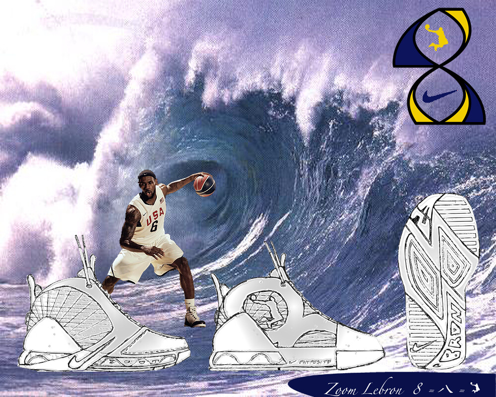
Hi guys, I got inspired to join this forum from styleRIZAL’s entry which he posted on projectbluefoot.com. This place seems to be loaded with good advice and people who care about teaching those who’re interested. Well, here’s my entry for the basketball shoe. This is my first attempt at a computer rendering. I get photoshop and illustrator free through my school (on campus) so it was a great experience to feel around the basics for this first project. I feel like I kind of muddled my way through the process. Any advice would be great.
Here goes:
The MVP of last season stands 6’8’', 250 pounds of explosive muscle. What sets him apart is that his physical force is supplemented by a skillset of dexterity and suppleness; he moves and sees the floor like a guard and is possibly the most well rounded player in the league. He can fly in out of nowhere to block shots and can bump and bruise for rebounds. He can freeze defenders with a silky spinmove and can pull up long range with a soft stroke every time. I compare Lebron to the sea, a huge mass of power and force which moves fluidly, adapting to any container. Sea or not, seven years into the league, the hurricane kid who can do it all has yet to get to the Finals.
Enter Lebron’s eighth signature shoe. In Oriental culture, eight is the luckiest number. The character for it in Chinese consists of two strokes strongly resembling a wave. My design combines visual characteristics of the Arabic numeral “8” and fuses it with a wave form inspired by Lebron’s sea-like powers.
Materials and technology also factored into the design from day one. My favorite Lebrons to play in are the Lebron III lows and the Lebron Vs. The III’s caged Zoom Air gave the most trampoline like cushioning along with court feel and stability that I’ve felt in any shoe I’ve worn. The V’s Phyposite construction makes the shoe an extension of your foot like Foamposite does, but without the weight. To further lighten the upper, I’ve decided to use a Flywire cage. Flywire + Phyposite = maybe Phlyposite? The result is lightweight stability and fit. “Phlyposite” encloses an inner bootie with a tongue perforated much in the same way as the Lebron V tongue is perforated.
The overarching goal was to assemble a shoe that takes the best of what has been done with the line and implement it with a strong visual design incorporating the lucky number eight and the wave/sea comparison I drew earlier. The ultimate success would lie in the shoe’s lasting power, essential for two reasons: