Need some feedback/Advice: Year in Review

It’s been a long year for me. Mostly it felt like sitting in a truck in 4 feet of mud with the pedal to the metal and tires spinning! And somehow I find myself in the exact same place that I started. That being said, I wanted to post up a review of some of my projects this year (I made some tweaks and color changes to keep it interesting since most have been seen on the board already) and try to get any feedback or advice about what I can focus on. What needs improving. (sketches, technologies,layouts, stories) Etc, etc. Hopefully some of you veterans can give it to me raw so that I can get over this seemingly neverending hump! My thoughts right now are to get back to more hand drawing, and try to leave illustrator alone so I can work on rendering in photoshop. Thanks in advance for insights that ANY of you can offer. :slight_smile:

-TH


Hi Tony. I dont know where to start…Do you feel like your work is not at the level you expected it will be by the end of this year? Or is it you job that got you tired because there is not too much innovative concept you can do there? I will say that your work is great and honestly, you deserve to work with the big companies, but you need to prove it to yourself. Dont be among the average, set yourself maybe 5 concept that you will really focus on and show the best of the talent you have. this project will show you how far you can go, and gives you more confidence to go and sell yourself to big companies.

Concerning your work it will be better if you could spend some times learning photoshop and really bring your designs to another level. You usually have good stories and reason when designing, your layouts and presentation are clean and communicate your design, but you could improve it by making it more simple in a fashion way sometimes ( one color background/ sketches and rendering together like the board of your kendo design.

Concerning Technologies, you dont really need too much,you could focus more on the design language, the lines, how can you make them agressive, soft, organic so that people will feel it. your design should be emotional to people, like most of the cars now. car designers sketch cars that have an emotional connection with the customers, why dont you do the same thing?

I believe that when we are attracted to a girl, an objetc, music etc… it is because of the impression we get from looking at her/it and the emotions that happened inside of us. Design is the same, it’s not about making things look cool, it’s about expressing your emotion. :smiley:

Hey man.

I have been following KG for a while now. Finally, I am getting involved.

First, I think you have had a pretty good year. Very consistant, but I am sure you did not post to hear the praises, and although I am far from a “vet,” I think I am familiar enough with your work to hopefully add some helpful critiques.

I always knew I could expect a nice, clean design and rendering from you each month. Unfortunately, I think your renderings are missing a bit of a knockout punch. I think this has to do with the way in which you choose to render in illustrator. The designs are always, “dang” at first, but I somehow lose interest. I think this has to do with the lack of expressiveness in the rendering.

I think if you would combine what you do in illustrator with PS, you would be killing it. For example, do your sketch, do your linework, then take the linework into PS. One thing I have found helpful is dropping the linework into photoshop as PATHS. You can then make selections based on these paths in Photoshop and render from here.

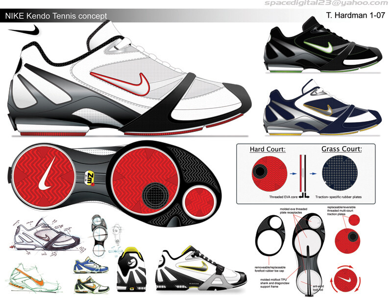
To take this a bit further…I have done a quick 10 minute bump up in Photoshop to show you what I mean. I think you could take these paths into Photoshop, make sure they are closed so you can do your fills, then render the form as a whole. This will make the form read more and your renders will look less flat. Second, use the paths to make selections for each detail you wish to add. I have made a bit of a soft chamfer around the black (below). I just made a selection with the lasso tool for now, but if you had those paths, that selection would be perfect. You could then feather the selection to make it as soft as you want. This could add to the design’s aesthetic. Also, I think it would be percieved as more real if you made these surfaces have some depth rather than them just running up to each other.

I have included this image which I just did two layers over your existing render. One was a “cores” layer, the second is a “bevel” layer.

I think many of us would be happy to be where you are, but I thought it would be more helpful for you to be a bit critical.

Take care man,
David

Tony_

As stated above you always have a lot of great ideas and clean execution.

I think you already know what you need to work on. I get the sense from your post. But I will try to restate it to see if we can validate your thinking.

  1. form language. right now most of the projects have a very similar form language. I think you can use the concept projects for different brands to show more formal diversity. Right now if the logos where shopped out of all those renderings the only one that might have a strong brand identity is the Jordan because it is so clean. The design should ell the story of the brand, not only through logos, but through pattern, form, details, and last shape.

  2. Edit your ideas to create iconic designs. Too many ideas can muddy a design. Pick one strong idea (cast a leading actor) and have smaller ideas that directly relate to it (supporting actors), make sure the main idea is 360 degrees around the shoe, make sure all the details relate both in concept and form to the main idea. Edit to refine.

  3. Loosen up: I think loosening up and doing more hand sketching will help this. Stay away from the illi, I’ve actually been going straight from tons of hand sketches, to hand render, PS (no illustrator) for this same reason) like this: Hussein Al Attar Photoshop rendering

Tony, just pushing yourself is more than many professional designers ever do. It is tempting to get complacent. It takes courage and guts to put your work out there consistently, and even more to put it out there and ask for this type of feedback. I admire that and have confidence that you are going to take it to the next level.

It’s been a long year for me. Mostly it felt like sitting in a truck in 4 feet of mud with the pedal to the metal and tires spinning! And somehow I find myself in the exact same place that I started… so that I can get over this seemingly neverending hump!

i am wondering what YOU feel that hump is? while i do not disagree that PS’ing these would add another level of detail/quality to the renderings here, but the ideas presented in each of theses are unique and shows your passion as well as your skill for doing this (i would also add that your sketches/marker renders communicate this a lot more imo). not sure why you have gotten that call, but i fully expect for you to be do it your thing for the majors. i too am curious to hear/read what the vets think is lacking from the work or would be necessary to get to that next echelon status?

Thank you all for taking the time out to give an honest look and an honest response. It’s key for me to be able to grow.

Karabo: I’m not unhappy with my job. I have one of the best jobs anyone could ever ask for and skechers treats me great. Obviously, from a design standpoint it’s not challenging in the way I would like to to be. I can’t wear my designs since they are for kids, and they don’t solve performance problems or have any relevance in the world of sport. I have tried over the past year to break out of the “basketball only” rut, and explore some different types of footwear. I have also tried to expand in terms of exploring some different inspirations and digging deeper to tie these stories in with the functionality of my designs… I think I have actually grown a lot in these respects, but there is always more to learn for sure. To give you an anology though: If I were striving to be a Chef at a top restaurant, I DO have a job in the restaurant industry, but I am working at Mcdonalds. lol…if that makes sense.

On a positive note, I did have some offers this year from excellent companies, that perhaps I should have taken. They just didn’t feel like quite the right fits when weighing in all the factors in my life right now. But it did give me some validation, and that was a HUGE step in the right direction.

David: You make great points. Thank you!!! More dramatic lighting is one thing that will definitely bring my renderings to life in addition to the other things you mentioned. It’s time to go full speed ahead on the photoshop. I was thinking about picking up Scott Robertson’s dvd tutorial. Has anyone checked it out? It seems to be sold out everywhere…

MD- great feedback. I can agree that form language is one of those things I am still chasing down. It is a quite vague and intangible thing to approach for me. I was actually looking at the mall tonight to try and separate the brands, but almost everything was a blucher with different logos and graphics, so that was unsuccessful. lol. Are there any books about this or even examples you could post of your own work or existing shoes? Is this something you learned in school? What type of exercises did you do to study it?

Thanks again, all.

-T

“I can’t wear my designs since they are for kids” :laughing: i feel you.

Scott Robertson is my one of my teachers at school, is DVD are really helpfull, he goes step by step and explains most of the sfuff he does. There is another great concept designer asian guy who used to be is student to, if i find is name i will post it.
Form language or design language is really simple, your design has to be in harmony, each element should be similar (same familly) but different in another sense. You already have this skills, it shows it in your work. You just have to go beyond what is expected or common when designing.

Here is something i did to practice in photoshop. I chose a shoe that i like and render it in photoshop using pictures of the existing shoe as a reference. You could also do that to learn faster.
I made a color code so that you could understand better what i said about design and form language. The lines that have the same color mean that they have the same form language.you will notice that at the end each lines has the same flow and work together as a whole.

…beside what you say, I see some progress in your design.
Your illustrator rendering are now more precise and detailled, the shape of the shoes look even better.
The presentation of your works is now (vitus stuff) better and a bit more consistent throughout same concept…less types of fonts, inspiration pics better presented, etc…

What I see could be inproved is:

  1. the shape of the outsole seems not correct in some of your design, fore foot too wide.
  2. some of your basketball shoes seem to be heavy…I’ve said “seem”. I think that a part of it is due to the lack of stronger shading work, it’s like it makes disappear a portion of the upper/outsole giving depth to the design.
  3. materials thickness, using just a line to separate different materials, keeps them flat. Using a different technique you can shade a part of the border of materials and lighten a small portion of it creating a “real” edge, you know how to do do this better than me for sure in your hand renderings.
  4. backgrounds. At kicksguide, you said your women vitus wasn’t banging out of the screen, so you changed it from white to black…well, I liked a lot the white one also, but over a full white background it doesn’t stand out!

About the concept behind the shoes, I think you always have great ideas. Probably, as MDT said, you could use just one idea and bring it all over the shoe, then use other stuff for smaller details…but it’s tough when you have SOOO many ideas…:wink:

About the rendering technique, I think your illustrator is very good.
Using photoshop you can also use a lot of different techniques depending on the type of tablet or mouse, so you can really create your own way, mixing different styles.
With a cintiq for sure you can use same hand drawing techniques but with the addition of layers, undos…never tried it but seems fastest and the most natural way…but it’s not for every pocket…

In my small experience this is all I can say…hope it’s helpful

Ciaooo
MC [pietro]

PS: you know this, but I forgot to remember it to you…BE PATIENT with your work, the fruits of what you have done this year will continue to appear in the future even if you don’t see them now.

Your right, it is very intangible. I do a few things.

  1. I read a lot. Both fiction and non fiction. Fiction, I read a lot of sci-fi, mostly classics from Bradbury, Heinlein, Philip K Dick… non fiction, try reading up on topics like semantics, modern philosophy, psychology, history, economics, design theory (Norman)… It all stretches your visual imagination.

  2. I lay out my portfolio constantly. It helps remind me of what I’ve already done so I can try my best to avoid remixing the same designs, and see what paths I’ve gone down frequently, and what I have avoided…I try to go where I have avoided…

  3. draw other things

  4. draw, paint, visualize, sculpt, whatever… some abstract form exercises. E Scott Morris makes beautiful abstract paper models at the start of some of his projects…

Wow, great suggestions guys! I love this place! :smiley:

Karabo: loving the ides to render an existing shoe just to learn the ropes and figure out the techniques!

Pietro: Thank you! Awesome insights all the way around and right on point. The suggestion of depth in rendering is great.

MD: Man, I wish I felt like I had time to read. LOL. Interesting that E. Scott Morris does those abstract sculptures…but he is a crazy talented guy, so maybe I will try something like that. I definitely want to get back to drawing some other things. I have been on a shoes only art diet for like 6 years.
BTW: Nice PS tutorial! It’s definitely more geared toward trans renderings, but there were some good general tidbits in there that made sense right away.

TH,
I think your stuff looks great! Obviously there are always areas where we can all improve. In the industry I’ve noticed that there are natural tendencies for some people to be proficient at one thing but weaker at something else. I think its great you recognize this and look to where you can improve. That being said I think the best thing that has helped me so far has been sketching and working on projects that are not shoes. (kinda like MD). Also, one thing I can appreciate from your work here is that you ARE branching out and doing other relevant footwear projects that are not bball shoes. One of my frustrations with stuff people post is that it does a lot of the time tend to be basketball. Portfolio wise I think most designers hiring are gonna want to see depth and breadth and not just a one trick pony.
Just curious…there is probably a job you want that you wont be happy without…where do want to end up?..Nike, Jordan, your own company?

Thanks JM!

Yeah, I think I will probably always feel like I have something to prove and lots to work on.That’s just the way I am. But I think it’s a good thing because it keeps me learning and growing and hungry to get better!

To answer your question: Yeah! :wink:


-TH

Hey Tony, could you tell me how you do the herringbone pattern on the outsole of your designs? it will really help me,i’m working on something now.

Thanks

Hey Karabo:

Draw a line in illustrator and increase to the desired stroke width. Go to “effects/Distort/zig-zag” and play with the size and type of corner (sharp or round) then apply effect. Outline stroke/expand appearance of new zig zag line. Copy and paste the line below itself holding “alt” key while dragging. Press “command” and “D” to repeat to you have several repeating lines. Group and reduce the lines to the size you want your herringbone to be then make a clipping mask in the shape you want the herringbone pod.

Dang…I never realized how involved that was. LOL

Of course, that is the long way that I used to do it (and how the above ones were made). I would likely make a sawtch for it now and just fill the shape with the swatch, but it’s too much to explain here.

Hope this helps!

-TH

Tony-
I appologize, because I feel I can’t give you much help, since you are light years ahead of me, along with most on this board…
I just wanted to drop in and say you have done an amazing job over the years, and I always love seeing your work…And I think as you just continue to put in the work and still build the portfolio, you will be where you want…You have done great work and great effort…I know you don’t seem to optomistic right now…But I know D.E and others are watching…
Good Luck…

Thanks Tony :laughing: sweet