Hey everyone, nice to meet you. I’m an aspiring graphic artist and industrial designer. I know my work isn’t the best out there (I’m no Andrew Kim) but I thought I’d post what I’ve been working on. But first, a short bio!
Brye Kobayashi Age: 17 Location: Hawaii Applications: Photoshop CS4
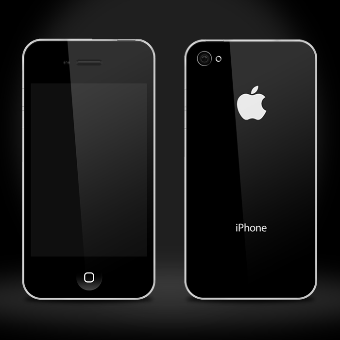
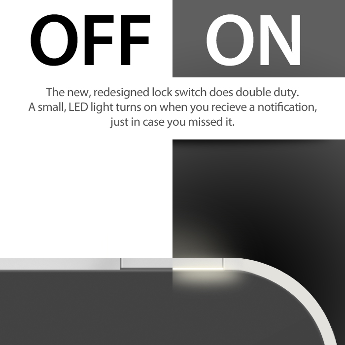
This is the concept: edge to edge strengthened glass, textured aluminum on the rear with a back poly-caobonate band that runs around the top for the antenna (no more “antennagate”!), and upgraded 8 megapixel camera with an LED flash. The front also sports a new HD FaceTime camera with 720p recording. I also loathe the lack of a LED notifier, it’s one of the things I miss from my Droid Eris. So, the way to fix this without sacrificing design of functionality is to micro-perferate the On/Off switch and place an LED light inside it (sort of the same concept of the MacBook Pro’s LED notifier).
This is the top and bottom. I wanted to figure out a way to add another speaker for stereoscopic sound, so, given the extra space on top, another speaker could theoretically be placed there. This design would also would slim the iPhone down to a mere 6.5mm thin, making it one of the thinest phones out there.
I know my skills are pretty mediocre at best, but I’d love to know your thoughts. I’ve got a lot to learn, so please, any tips, criticism, or suggestions are appreciated.
I wouldn’t worry about the skills (I mean a little, always room to improve, but you are showing the idea and that is the point.
A few things to think about:
most phones have multiple antennas, and they can’t be stacked and may have to be on opposite ends of the phone for reception… having the plastic on one end does not solve for the antenna transparency issue, you may ant to adjust or have bands at both ends.
our of curiosity, why no 3d camera?
the aspect ratio of the screen seems different? Is that so and if so why?
in the top and bottom views the glass seems to be flush, but in the front view it seems to go to the edge. It would be at minimum .5mm thick, the current iPhone’s is 1mm I believe…
the bak pannel has a nice curvature which I like a lot, and is a complaint about the current phone, of course it will make it thicker by maybe 1mm… but not my point. It would feel more resolved if the top view details responded to this curvature in some way.
I never thought of that, although the first iPhone had a something similar situated on the bottom half of the phone…
3D isn’t really a mainstream technology, and would mean changing the screen and OS to 3D, adding a 3D slider for adjusting the effect, and adding another camera to the back (more $$$) - although, it would be pretty sweet to have them!
It’s probably off, that’s what I get for estimating…
The black strip on the back would meet flush with the screen on the front, the rest of the screen would be bordered by the back casing. I’ll try to fix that in my revision…
Furthermore solidifying the lack of my skills. I’ll try to fix that as well.
Edited it a bit, hopefully that makes it clearer. I measured out an exact 4:3 ratio for the screen and fixed the boarder. And adjusted the shading on the back… And thanks again for your help.
Yo hit on some good points with design, and maybe a little on tech.
I’d like to expand on the tech a bit. A lot of mobile phone design is driven by the technology behind it. This requires a fair amount of research to really understand the underlying technology. The antenna issue is a prime example of this.
Yo: the iPhone 1 and iPhone 4 actually have roughly the same antennas:
GSM (or CDMA for Verizon) for calling/voice transmission
UMTS for 3G data. (4G will require something like HSPA+ or LTE) This is where the black plastic (in first iPhone and on 3g iPads) or an exposed antenna is required. UMTS cannot get through metal.
Bluetooth
GPS (I think this is the only antenna that wasn’t in the first one, but may be wrong)
WiFi
Future devices may start to include NFC components (certainly Android will, as Google announced their Wallet program last week).
Would be nice if you expanded on some of the features you added, like showing the notification LED via micro-perf through a callout circle/bubble.
I’d like to see more work on this concept? I think you may be locking yourself a bit by only limiting yourself to Apple. Why not another OS? Create your own? Could be a fun challenge. Smartphones are more than hardware: they’re about the UI and how hardware influences the usability of the UI.
also, I don’t see the volume buttons in the top and bottom views, and I’m sure I should according to the front and back views. They seem to protrude more in the front view than they do in the back view… a side view should really be shown to understand them, according to the back view they look pill shaped.
One thing this doesn’t really answer is WHY? It seems to be a design solution that is in parallel with the current one, just another form. What goes beyond the current model (other than LED notification, which you could add to the current design) ? How does this harness new technologies and emerging behaviors between different types of devices.
I like keeping it an Apple because of the rich existing ecosystem of product, harness that.
@Yo: You’re right, it does lack a focus of features… I started out from a pure design point of view (and like 4 hours of work from scratch, twas really fast.). I’ll try to think of some ideas and get back to you, hopefully with more renderings.
No worries, it is a good start! It is good to get it out into the world for feedback! Now you have a whole bunch to think about because you put a few hours in and put it on core77.
Yo and Tarn raise some good points. I think it’s a nice sketch overall. The top and bottom corners seem a little sharp.
If you want to push this concept further, definitely measure a screen and print everything 1:1. At cell phone scale, the details need to be considered down to 0.10mm. For instance, try measuring the chamfer on the speaker slot of an iPhone 4.
I was hoping you would weigh in Brett! Definitely print 1:1… also, if you want to get a sense of those corners in your pocket, cut a piece of sheet metal out at that size with the same radii… now put it in your pocket… I guarantee you it will convince you to increase the radii
Interesting how the radii on the blackout area around the screen does not respond to the radii on the outer form yet… it can and should.
it is a nice illustration, great job - especially as HS student!
Like some the other posters, I also wonder why you’re limiting yourself to Apple - it’s a very nice look, but it’s also a very reduced design and as they say, 'its more important what they didn’t put in as what they did." If you are going to do this in the Apple style, I think you could push this to be even more in-line with their ethos.
This is my opinion of course, but I see some spots where it doesn’t look Apple. They probably wouldn’t show a grill detail within the phone speaker recess in the glass - more simple would be a black recess and hidden grill. The kink on the sides of the curved back (in the top view) seem superflurious and un-apple - seems more like a Samsung or Sony phone detail. The metal on top of the black plastic, seemingly for aesthetics only, doesn’t seem apple. Nor does the rendered radius highlight on the plastic where it touches the curved metal back (in the back view) - on my iphone 2g it’s flush with no radius. The squared off corners and metal border around the screen doesn’t seem Apple either, but I guess there is some precedent on the shuffle and monitors
Since it’s a concept, you might want to take it further out too, again like posted above. This looks like the iphone today with a different form. Maybe think about what would be different if the covers if apple designed it to be manufactured from that injection molded liquid metal, the company they just bought. Or what it would be like with half sized batteries or exhausts for a fuel cell. Maybe what an iphone would be like with the flexible displays that seem to always be just on the horizon…
Yeah, now that I look back, the overall shape and aesthetics aren’t really Apple, more Dell Streak than anything else. It’s definitely a challenge to think about changing the iPhone, and not much can be done to it less it looks like some other run of the mill Samsung or HTC phone. I’m back on the drawing board, I definitely want to do other things besides Apple products, but I really want to see if I can do something like this first. Thanks again for the feedback, I’m kinda at a loss for instruction and critique, as most people around these parts don’t even know how to even use Photoshop.
I didn’t catch that you are only 17 (designers don’t read much )
Keep working the concept and posting. This is off to a good start. One helpful exercise might be to split the concept into brand iterations. For example, you could show us a side by side of how you think Apple, Samsung, Sony, RIM, and Nokia would resolve this design differently. That might actually help you to push it more Apple. Or if this was a new brand, as Julius suggested, you could explore he principals, ethics, ethos and language that you feel best meets an underserved need or desire in the industry.
Nice render, OK, concept. Aside from all the technical stuff which has been covered, I’d like to here more about the intent. What is it that you wanted to do different than what’s already out there. To me, just looks like another slab phone and honestly not as nice as iPhone 4. Keep in mind that you need to be thinking 1 year+ out. iPhone 5 is already done and in the can and Apple probably is working on iPhone 6. What more can you bring to the table? What distinguishes your concept from others?
You haven’t much spoke about the thought behind it. I’d work that up, consumer profiles, inspiration, exploration, etc. before getting too deep in a render.
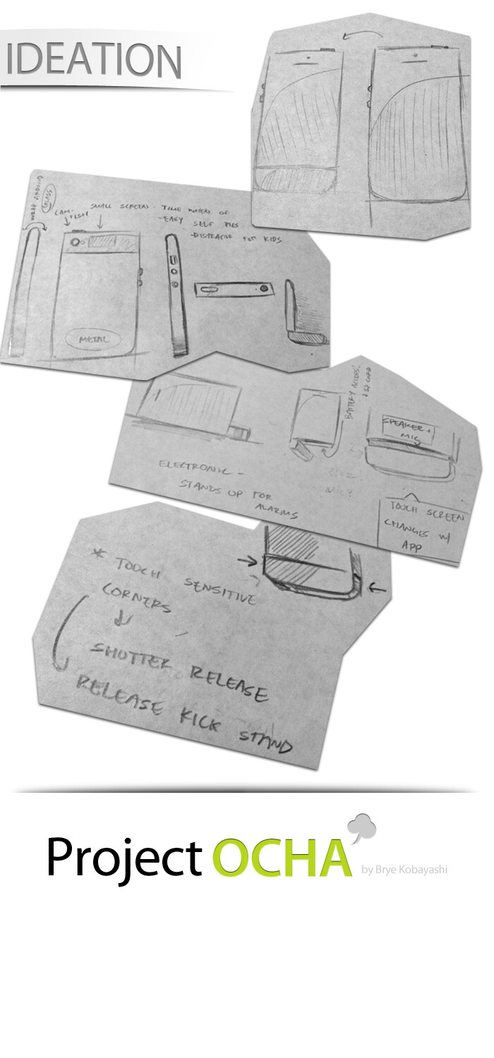
Yeah, I’ve gone back to the drawing board so-to-speak. I cant really get much done on my small 13" MacBook. I’m also set to move in a few weeks, and have pretty much everything packed up in boxes, so I cant even sketch on my Bamboo. (Paper doesn’t do it justice.) I’m not done yet, this is all I got done with today. I’m finding it increasingly more lucrative to just scratch the whole iPhone idea and just make something completely out there without any constraints to any sort of company. But yeah, this is what I made.
This would sort of be like my dream iPhone. I couldn’t really stray too far away from Apple’s design “philosophy”, so I tried to improve it a bit. The band would come all the way up to the cover and back glass, as the iPhone 4’s glass jets out a bit from the band. I also imagined using the liquid metal to keep it structurally stronger. Here are a few more ideas to put up there:
Pressure/touch sensitive corners for enhanced gaming and gesture functionality
Extend touch area of front cover glass to edges - more gestures and functionality
Using that “paper battery” concept to give more space inside
Induction charging (that’s why I excluded the 30 pin dock connector) and a multi-functional charging stand (alarm clock mode, etc.) - Since the whole iCloud thing will probably happen, syncing can be done wirelessly, and an adaptor could be used for 3rd party accessories
NFC - extend it’s usefulness to send music, video, interact with other devices, notify of discounts at stores, etc.
Add on an anti-glare (the type for glasses, I know it exists) and hydrophobic coating to the front and back glass - easy cleaning
There’s some sort of second generation IPS tech that LG or someone created, that could be useful
Memory glass alloy (with some sort of rubber base) that prevents scratches
I think I’ve given up on this thing. I’m off on a new venture, something not tied to any company or design ethos. I found some inspiration in Andrew Kim’s HTC 1 concept, as well as the “Modai” project. I have a faint idea of how I want it to work, but for now, it’s just about looks. (I’ll probably start a new thread or something…)
nice job on your re-spin - it seems much more in-line with the Apple brand!
It’s a good exercise designing in a brand’s style I think, it makes you really think about what the elements of the design language are and what they stand for . Its a lot like classical art training back in the day, where you recreate the master artist’s work and learn about the decisions made during the design (what was right in that style and what wasn’t).
In fact, it’s much harder to come up with a refined brand language from scratch and then apply it to a mobile, but that would be a great exercise too
You work is above a HS level, so i’ll critique you at an above-highschool level. And be blunt.
I know saying BOSE sound and all that other text in Myriad Pro looks nice, but seriously distracts from the design. Remember, we’re designers, so I care far less about the brand of the audio (or the fact ‘flat is back’) than I do the reason why it’s better than an iPh4 (or HTC or whatever).
Why flat? It’d be rubbish for trying to keylock through a case?
That begs the question, what will the user do with my product once it leaves the box?
What sized fingers do they have? Whats the shape of a fingernail?
Why glass on the back?
So rather than follow an apple look blindly, think about the product.
Im at work, so i’ll make this a quicky. But think of the assumptions you’re borrowing from apple. Why are they there? Which rules can i break? Which bits will make the user love the product?