As summer comes to an end, I thought I would finish it off with a new project!
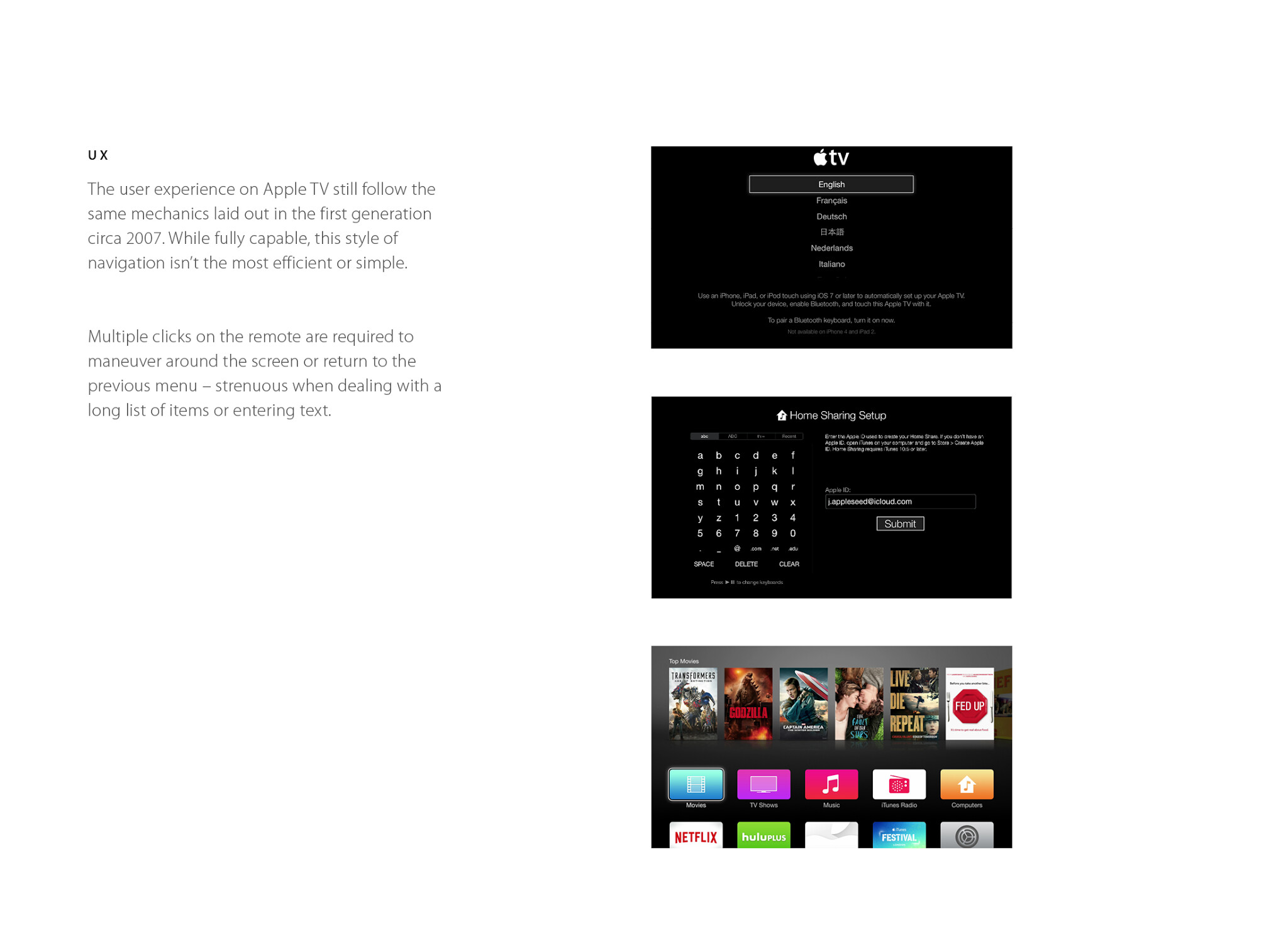
My family uses Apple TV every day, and it has become a focal point of our living room. My dad, especially, loves it to bits, and can be found using AirPlay to stream movies and videos at all times of the day. However, there are a few things that he, and the rest of the family, wishes could be better.
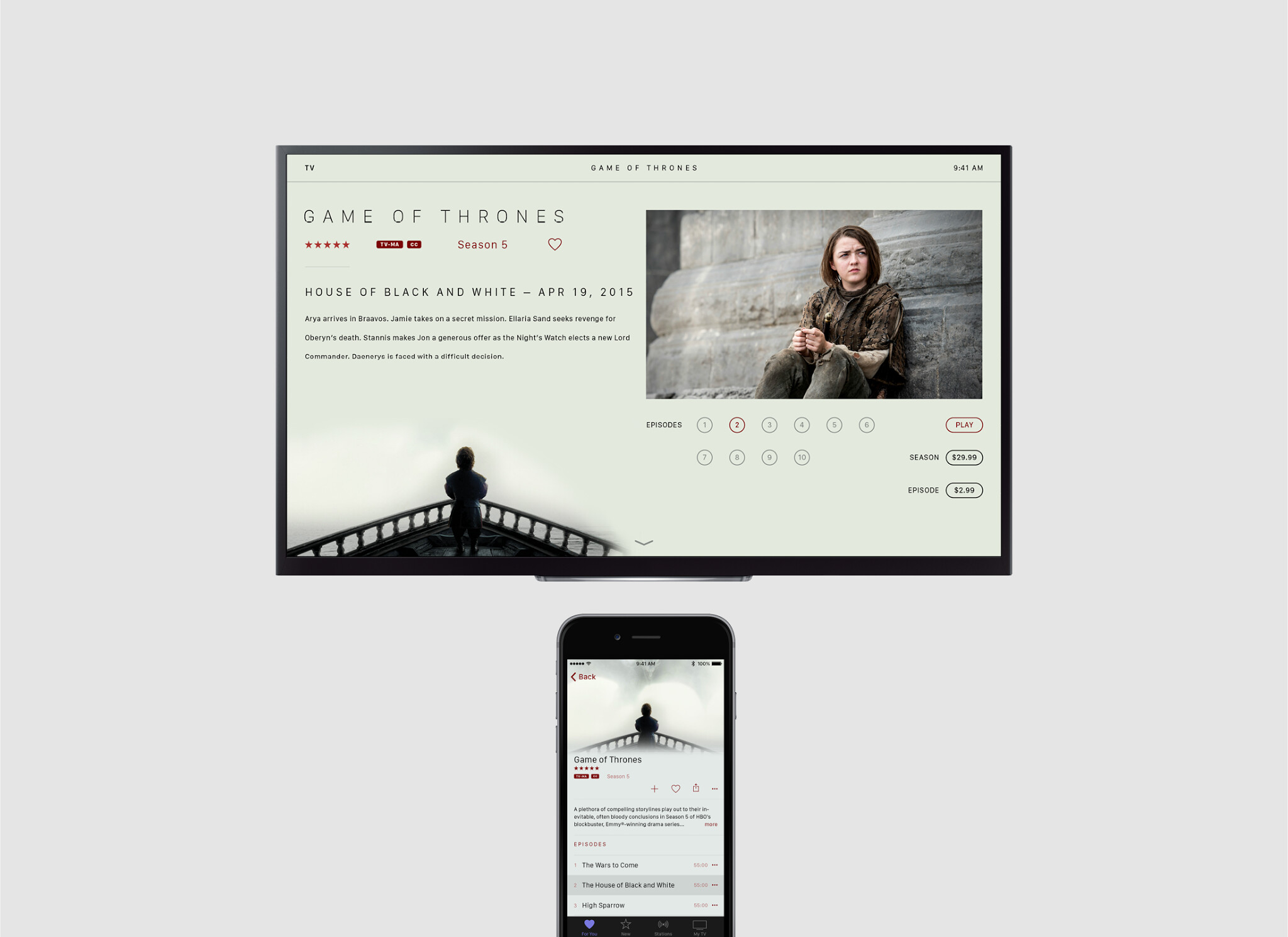
In this project, I try to envision the future of Apple TV and tackle issues with UX and UI. I hope you enjoy looking through this project as much as I did making it.
Looks very clean and well presented (to the point of almost being too formulaic). It’s bit hard for me to get whats Wow about this concept.
Maybe adding a bit of animation into this to showcase the interaction a bit more would be a nice touch.
Expand on the hardware a bit more?
Also the way you should your sketches and ideation seems very disconnected from the presentation style.
And when I do actually dive into it. One page is literally a word bank of ideas on what to call it. and pros and cons of other media services. Which doesn’t really makes it way back into the presentation. Theres a page on connectors and cables and is not touched at all in the preso. Don’t show work for the sake of showing work.
Either way its a solid start, very good work. But I need something that makes in memorable.
Thank you PB, the font is San Francisco (system font for Apple Watch and upcoming OS X and iOS) and Myriad Pro.
And thank you Sain for your critique. To address some of your questions:
Layout was done in InDesign, so I suppose it was super formulaic!
On hardware, my original thought was to include a port for cable TV, but later decided against it since it would defeat the purpose of streaming TV. I do agree that the expanding on the hardware would be beneficial.
On the word list, my professors emphasize a strong word list to build off while designing. The list was for the process, but was a great place to look for a name as well!
I’ll work to incorporate your suggestions in future projects. Thanks again for reading!
My only critique is that it feels a little too predictable. It feels like something that I would expect to see coming to market right now. I think you can push the boundaries further starting with the interaction concepts, then the visual design, and definitely the remote and hardware. When I was at frog I lead a team that did a next generation smart TV physical/digital interaction hardware/software design project for a large brand and there is a lot more room for you to push further. Focus less on making the presentation look like an existing product sell web experience and blow us away!