Have you seen the public voting they put up for the next Spacesuit, more like Mars-suite.
Anyway, the Z1 was looked “simple”, unobtrusive and functional. I would take that look over either one of the new “cartoony” styles.
Would do you guys think?
Have you seen the public voting they put up for the next Spacesuit, more like Mars-suite.
Anyway, the Z1 was looked “simple”, unobtrusive and functional. I would take that look over either one of the new “cartoony” styles.
Would do you guys think?
Personally, I think they all look hideous.
Agreed.
If we run into aliens, they may interpret the ugly patterns as a sign of agression and declare war on all of humanity. They’ll start to research our communication channels and find thinks like “Dancing w/ the Stars, Justin Beiber and Honey Boo Boo” and they’ll consider exterminating us a favor to all life in the far reaches of the universe.
facepalm.
Who came up with the titles/brief?
A "Biomimicry
B “Technology”
C “Trends in Society”
Seriously? I would expect better work from a high school home ec class. They all look like fat suits designed by someone creating knock-off Pixar characters.
R
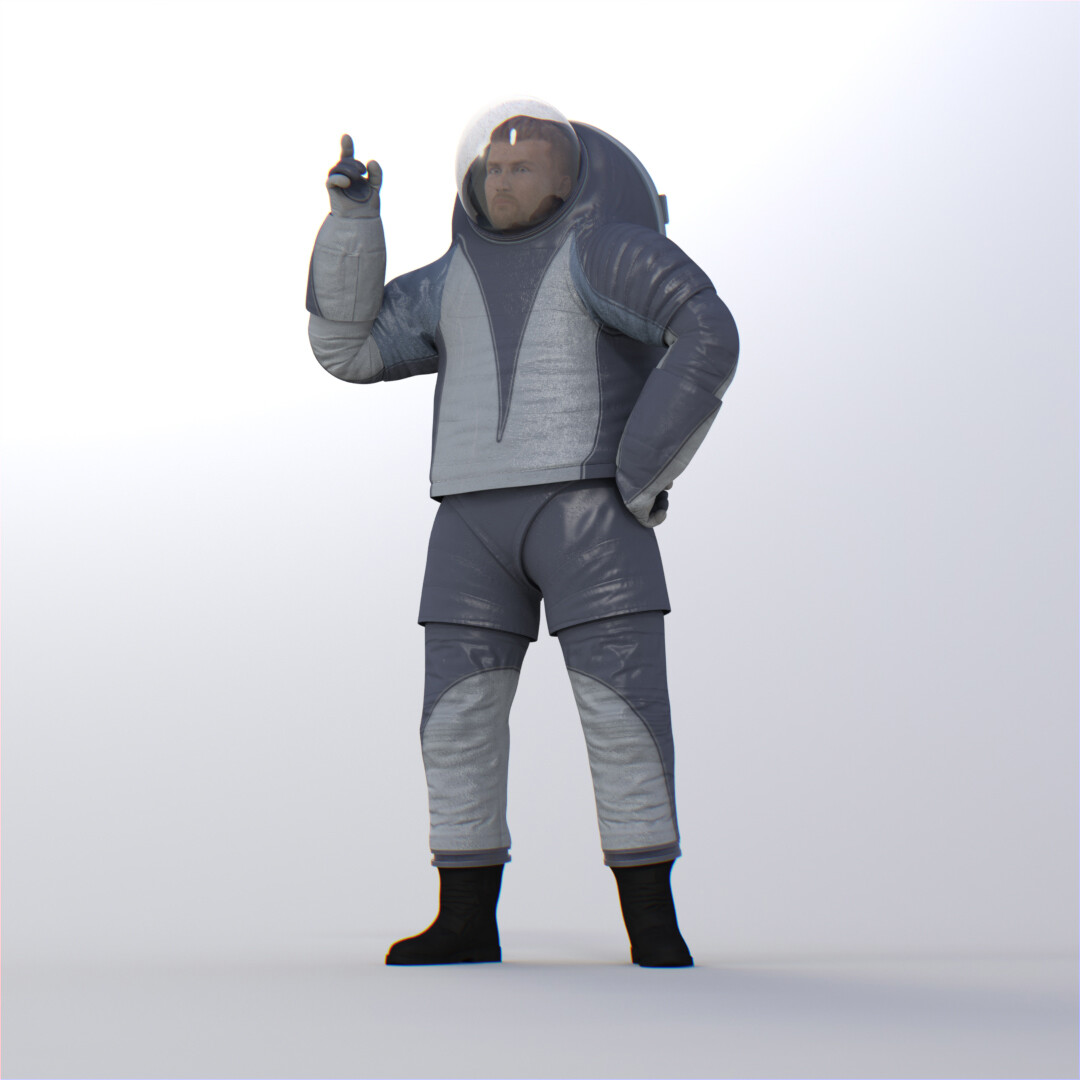
I liked that original (the white one).
I want to see spacesuits like the ones in ‘Sunshine’.

Ok ok those are not for planetary use. But I don’t think there should be voting for what spacesuits should look like. NASA needs to tell us. What the hell else will there be for us to be inspired by? ![]()
why are we “decorating” space suites? All of the designs are the same with a little icing on each. This is not design.
I feel like Buzz Aldrin would not wear any of these.
I feel like Buzz Aldrin would decide to stay on earth if they had presented that crap to him.
Sad that NASA needs to resort to a marketing gimmick to drum up support. Sorry to make this political, but I am tired of spending money to blow stuff up.
I know you’re being sarcastic, but come on; he would have gone to space even if he had to wear a clown suit.
That being said, these aren’t exactly fantastic designs, but isn’t this a case of form over function? Granted, NASA is extremely risk-adverse (ironically), but they are the experts in the field. I doubt it would have been feasible to present very different design concepts as well - either something like this works or it doesn’t. They could have one with integrated cup holders, one with a flashlight in the helmet, etc, but then - wouldn’t it be up to the astronauts to determine what’s valuable, not a poll?
I think you mean function over form cause this form is hideous. It looks like the person has a humpback.
Oh, you’re right. I did mean function over form.
Always wondering where this suit went though;
http://news.nationalgeographic.com/news/2007/07/photogalleries/spacesuit-pictures/
There’s a meme waiting in that post… look at that jaw. The Right Stuff.
Like, Buzz Aldrin’s spacesuit poo was reconstituted and named Chuck Norris, etc.
…and above all, I can’t get past the ‘shorts-over-highwater-pants’ look. I’m embarrassed for the human race - we’re gonna look like idiots if any of us meet extraterrestial intelligent life in this getup.
Hello human, it is nice to…oh yikes, what the f*@k are you wearing?
It would be a fun ID exercise to design a spacesuit…maybe a contest?
The proportions actually remind me of these guys:

I wonder why the bubble is so tiny, it seems way too confined in there.
J
Lol yea I can see that.
Spitballing, but I would guess that the bubble is probably small to minimize the chance of it hitting something and breaking (since it’s a Mars suit), and to maximize the strength to weight ratio of the glass; it has to hold back a lot of pressure in a vacuum or near vacuum environment.
But I really have no idea, since the space suits have larger bubbles, I think?
Lots of proposals for Martian missions suggest a one-way trip.
Could it be that the suits are designed to lower the self-esteem of the astronauts far enough to accept that?
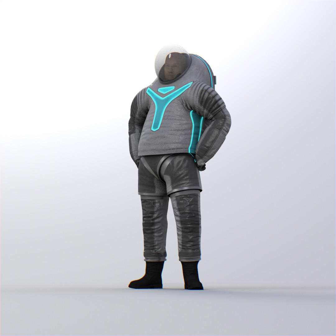
I find it quite odd how almost every single image on the site was rendered both in regular lighting and the dark. It’s almost as if the designers got completely carried away with the idea that you can light up clothing tron-style, and just forgot about everything else!
I’m not sure how red Mar’s surface really is when you are there, but it seems like the most important visual function if the suite would be visibility at a distance. In which case the compliment to red, which is green, would have the most chroma contrast and I think be the most visible? Seems like for safety the color should be functional, not decoraticve.