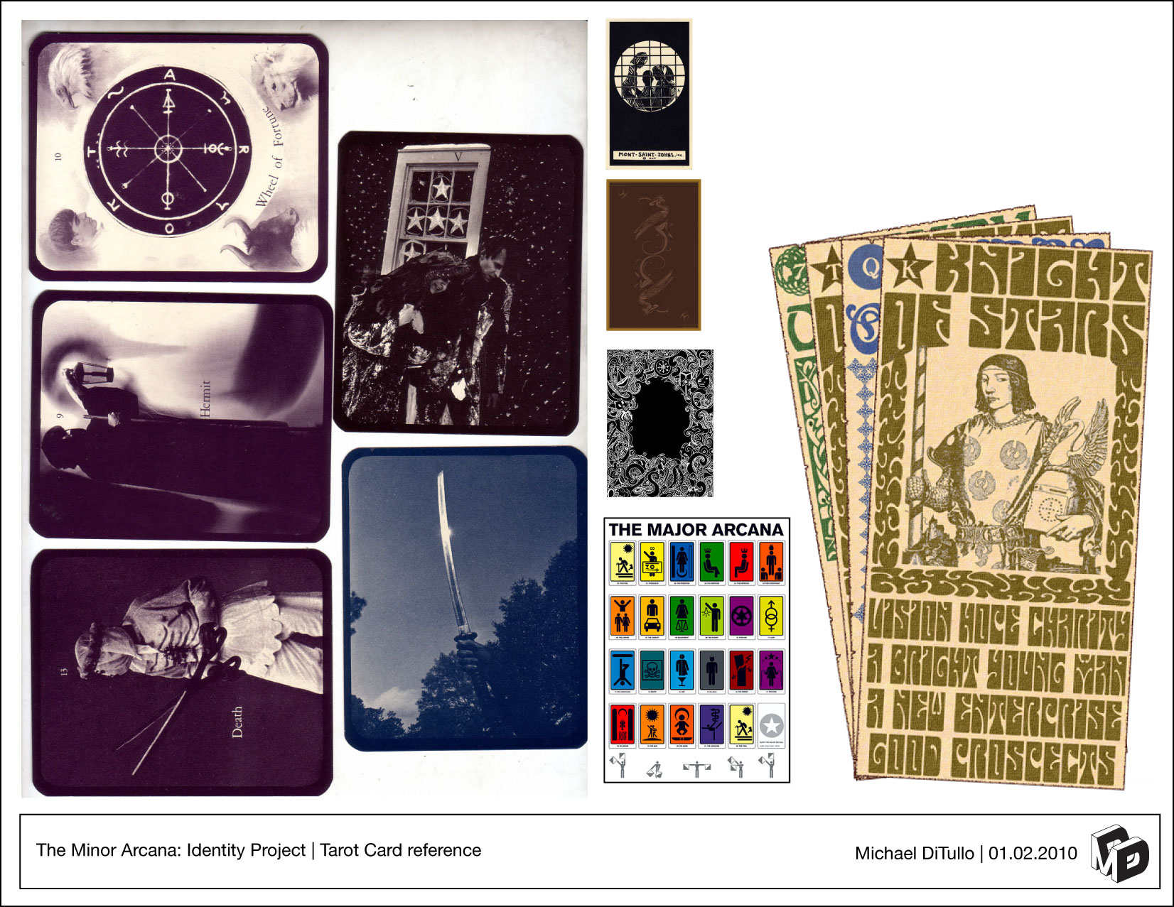
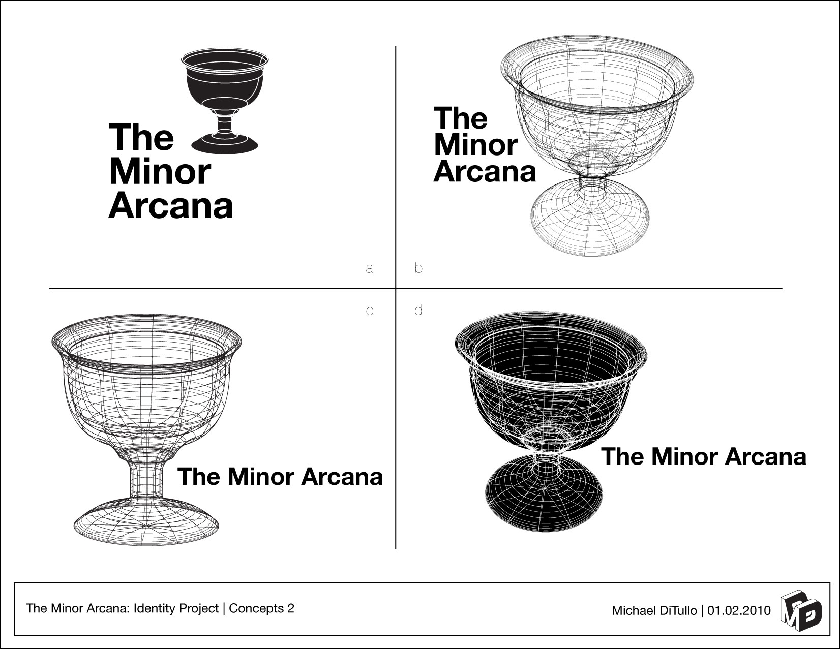
Hey guys, I recent;y took on this project for my friend’s brother’s bar in Brooklyn. Just a fun little side project. The bar is named the Minor Arcana, which is one of the Tarot Card decks, so I started with some visual research, then started to build concepts around the Ace of Cups card at his direction.
Second round of concepts based on client feedback to make it more “vintage carnival”… a challenge as that is out of my typical wheelhouse of modernism, but I thought I would see what I would do with the challenge. Could I make something I believed in with that aesthetic?
Great work!! I love the 20’s vibe you have going on. I am not sure what the bar looks like on the inside, but I envision an English style pub on a 20’s cocktail Lounge.
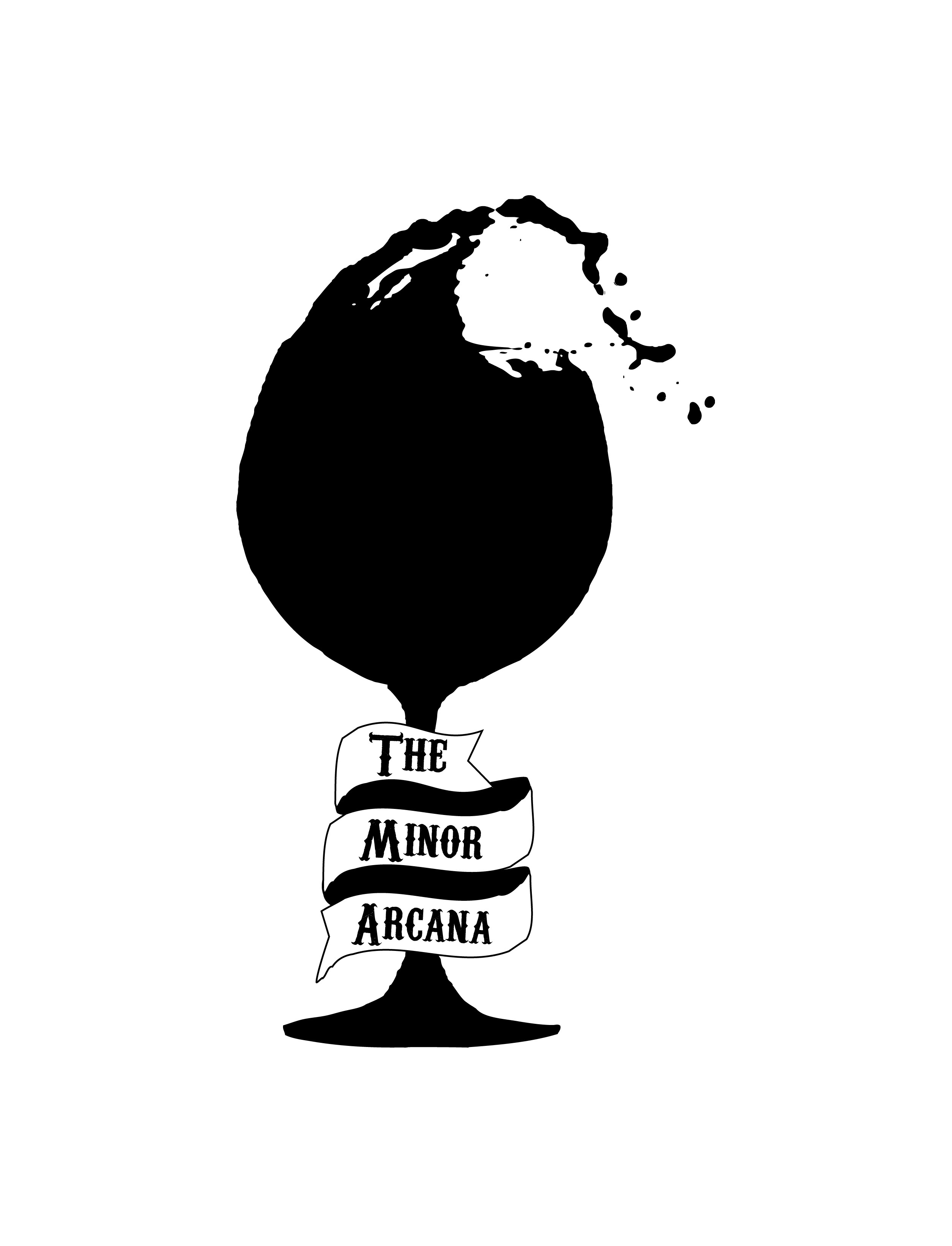
I am leaning towards the second one of your two finals. I think it is a bit easier to read. The only bit of feed back I would give you is to be careful with the smaller details in the logo(the small splash droplets at the top). These may be a bit hard to print, or may disappear. Especially if you are going to put them on tee shirts, flyers, and other promo items.
I, too, am leaning toward the second of the two choices as favorites. The only thing that bothers me is that the copy doesn’t “flow” with the banner. However, I can see that if you were to fit that copy to the shape of the banner, it might become a bit unreadable. It looks like you tried to do it a bit on the first option, and it worked alright.
Now try your hand at designing a sign for the building with this logo. That’s where the challenge begins.
I like the wine glass a lot. If this were mine I would lose the banner (sorry client) and put the type inside the glass in white.
Less elements for your eye to tangle with.
I like that its just fairly straightforward and not too busy B&W but I’m kind of missing the tarot card reference.
An approach more like this image
on wikimedia could be cool, and help create a consistent logo and layout for signage, business card, napkins, and coasters in order to make a more cohesive brand.
I think it is good that the tarot card is not too apparent in the logo.
It might be rather controversial and a lot of people find tarot and that kind of stuff rather spooky, me included. Also it could get a little too gimmicky a la Dr Jekyl & Mr Hyde type of restaurants.
The ribbon is definitely a winner but the fonts looks a bit stiff inside of the otherwise hand drawn logo in my opinion.
I am actually picturing a mexican joint based on the image. A From Dusk till Dawn kind of establishment.
Yo, you’re all over the place! Interesting challenge your working on this week, looks great so far
I totally agree with the above too… text seems like it should follow ribbon
also really like the splashing glass, it looks like they pour liberally! a thought, brining back the rim of the glass and maybe a swirly art nouveau reflection making the 3d ribbon match the 2-d glass might be interesting too. Looks very strong as an outline though
I don’t disagree with these comments, but if the point is to avoid “controversy” then why name the place after a deck of tarot cards?
The logo doesn’t have to have such a literal reference like the example that I gave earlier, but no need to cut all ties either. A little bit of a card reference could be a good thing, even if it was only that the logo is framed by a rectangle with rounded edges.
I like where mr.dudezu is going with his suggestions.
I think the logo would be a bit more cohesive if all of the elements maintained a consistent theme - in this case, hand drawn.
Personally, I would move away from the black silhouette of the cup - seems a bit “stock” and is perhaps too modern a treatment for the tarot theme
If it were hand drawn in the same style as the scroll I think the overall look would be more cohesive. (and keep with the Tarot theme)
There is something very cool and mysterious about that style of drawing/line-work that seems to be associated with tarot.
Another comment would be the size of the current text relative to the height of the overall logo. I think it looks fine right now and would probably hold up well at larger sizes. However… if this is scaled down to menu or business card size the text is going to be pretty small relative to the overall height.
Perhaps consider some exploration using a bigger scroll and font around the stem of the cup?
What I posted is done. Was just sharing. Should have made that more clear. Good points all. This was just a fun quick project. Will keep these thoughts in mind for the next time.