Just saw Minute Maid’s refresh. Has great appetite appeal, nice branding and screams orange juice. Enjoy!!
http://popsop.com/29831
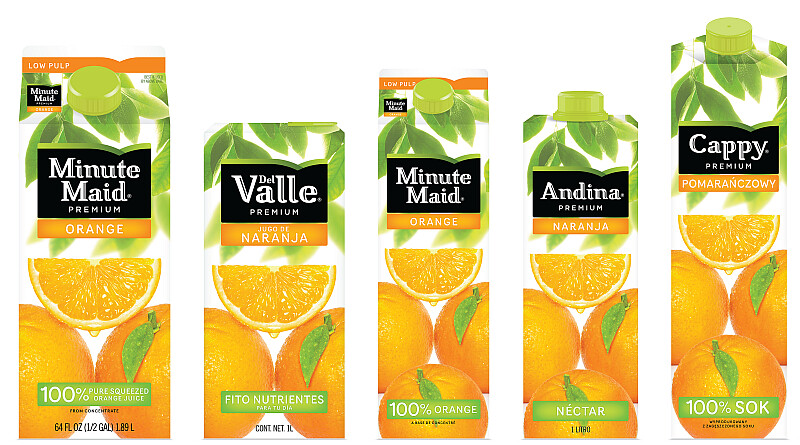

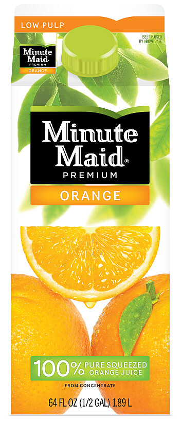
Yes i have to admit from a first look i really like it ![]()
That is a nice green they chose, i like it alot compared to the darker green that florida’s natural and trpicana were using.
Great Job Minute Maid! Nice!
I think they achieved what Tropicana wanted to achieve, that simple contemporary look. They kept the brand essence, didn’t change what people know of them, and I haven’t seen it on shelf but I would think it pops.
They kept the orange which seems to be pretty important. Not only that but those are the greatest looking oranges I’ve ever seen. I’m happy just looking at them. Coke does it again.
I really dislike the symmetry that is created by the two oranges at the bottom. Something about it just looks… wrong.
Also, the orange wedge seems to cut a strong line straight through the billboard which is totally distracting me. Above the wedge is asymetrical and blurry and then below the wedge it’s symetrical and great definition. I find my eye landing on the negative space just below the logo everytime.
I like it but do the oranges and leaves look a little too washed out to you guys?
It looks like the black (logo) was emphasized a little too much and the oranges fade into the background… though it might be the picture. Maybe its to emphasis a Black label = Premium graphic feel? I think I would like the oranges to look a little more saturated, slightly darker orange, and richer
Someone else commented that they liked the more subtle contrast, so maybe I’m off
That black logo REALLY pops! Wow
Minute Maid is a division of Coca-Cola aren’t they? Do they use the same package design resources as Coca-Cola. Just wondering because it seems like Coke has been very good at coming out with some excellent packaging designs and I am curious to know if there is some crack team of design geniuses that also did this for Minute Maid.
Minute maid is part of Coke and I was wondering the same thing. I know they hired a new VP of Design 4 years back and he has done a great job clearing out the clutter.
http://www.ft.com/cms/s/0/4bbedbba-d3e2-11de-8caf-00144feabdc0.html?nclick_check=1
This is part of their global design strategy for all their juices. It appears to be part of their system of scalable and customizable branding identity. See the design machine:
http://www.ft.com/cms/s/0/4bbedbba-d3e2-11de-8caf-00144feabdc0.html
Sorry, not to be crass or anything but does anyone else just see a big vagina in the way the oranges are laid out ?
Strangely it was that negative space that jumped out at me first.
I think it was since I learnt about the arrow in the FedEx logo that I see these things now
![]()
Honestly, the first thing I thought was that they were going for a subliminal “golden triangle” if you know what I mean. I’m not mad at it though. Coke has always been about putting a little s3xy into it, since the original Coke bottle.
I actually saw this in the store today and was very pleased. It looks just as good in store as it does in this rendering. Also I kind of like the symmetry aspect. I think it is clean it gets the point across and as pointed out by loafer does it in a sexy way.
To the point posted up by mgmt8…I love to see it when a CPG company as big as Coke can pull of a global brand consistency. That sounds easy, but that is a major task and I give them total props for that. I really hope it works out for them. I can’t wait to see this on shelf with all the cartons and varieties.
This is very nice. My only complaint is the big black box. They should have axed the background and made the logo text black.
It’s really a shame that Minute Maid doesn’t taste as good as Tropicana to me! They didn’t even keep the orange peel cap like they said they were going to…
Good articles. The brand certainly does jump out now, definitely recognizable from a distance when your looking down an aisle… props to that
Well the graphic design is good.
Nothing really innovative to me but good.
But the 3D, or volume, design ? This bottles line-up is a total mess !?
There should be a family of shapes for the blowmolded designs. I mean we are talking about the world n°1 in soda, with billions in sales, and they can’t afford some 3D design ?
I agree from this view it looks as if they are a mess, but you have to think to the cultures categories, etc…of the different countries. By making them all the same it would may not work on shelf. Example if they made the bottles in the US the same as the ones in India that for could be off setting to the American consumer.
as devils advocate, Coke does it… same bottle shape worldwide
This is true, but the Coke bottle is an Icon of the brand that has been established through tradition.
I have noticed the drink bottles, especially the size, are different here in the UK than in the US. I find them a little dinky… especially after being used to larger portions.
Being in the industry, have you heard of products rejected because of certain cultures not liking the packaging container shapes? I’m just wondering what would American’s not like about Indian bottles…