Hi. I want to really get there with marker rendering and sketching. I feel like the best way to do this is to sketch and render from observing existing products. If anyone knows any other good approaches for improvement please let me know.
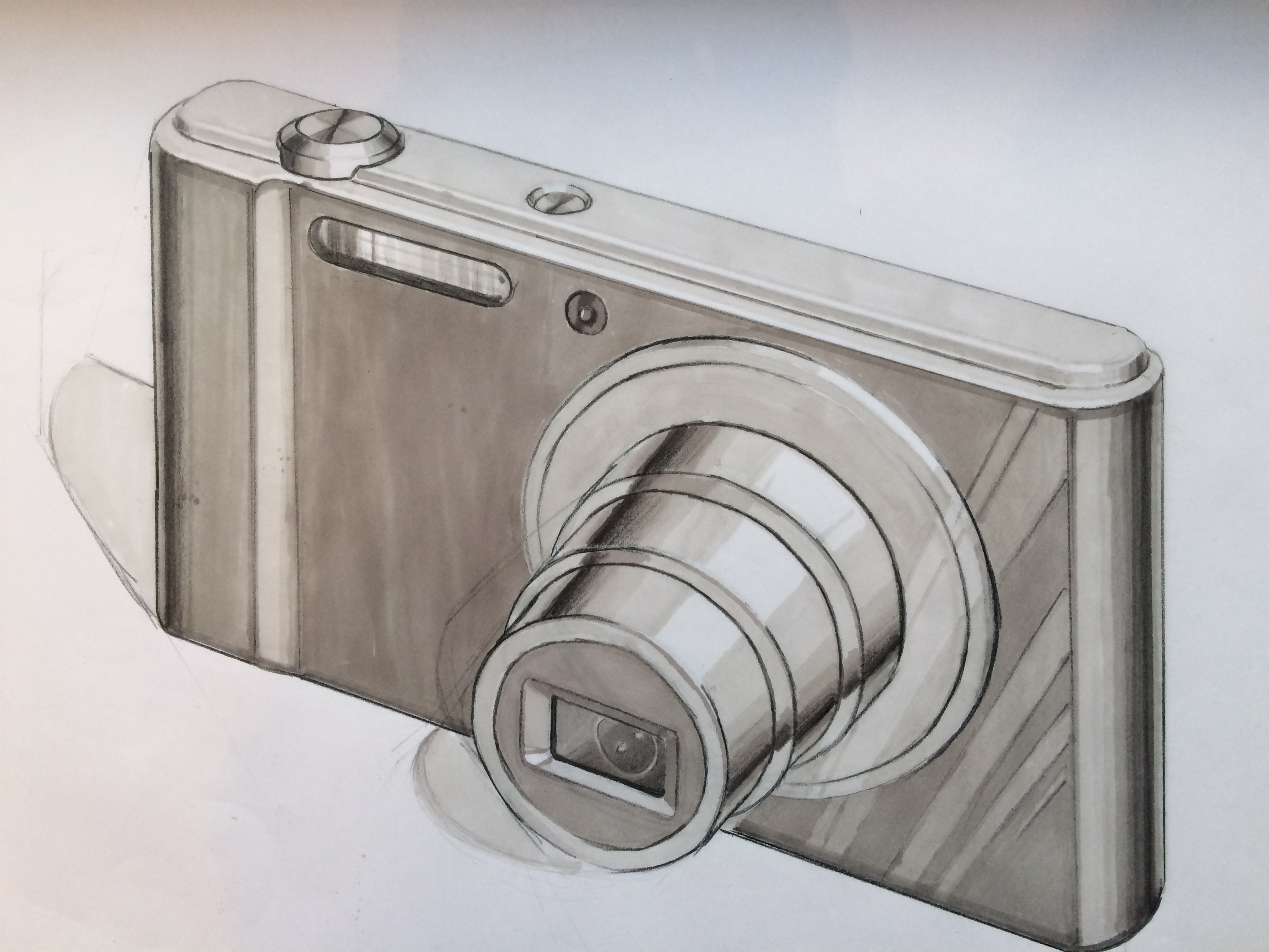
Here is my first attempt at a camera. It was a Sony cyber shot model. I’m not that happy with this one, didn’t go the way I hoped. Messed up on the cast shadows and also core shadow on the left doesn’t feel right. Anyways, any pointers from you guys, let me know
250gb, I wouldn’t beat yourself up. Think it is pretty good. I think you could have pushed the contrast a little more. I think it would be good to alternate sketching an existing product with one of your own design. For example, try sketching your own design for a camera in the same perspective.
It’s not bad, it does the job. I agree with YO on the contrast being the main problem, it looks like it needs another layer of shading, this will help to separate the material of the telescopic lens and the body.
Agreed with the other comments, I think its pretty good!
The perspective is good, maybe push it a bit more for a concept sketch but its bang on for a still life kind of drawing. The rendering is also really good
Definitely get a thicker line weight on the outside edges to make the sketch pop a bit
I’m looking forward to seeing some more work from you.
Thanks for the comments. Before I could read them I had already started my second try and have since completed it so here it is… Anyways I will go ahead and attempt to do alternate with my own design as Yo suggests.
-ps sorry about the photo quality, I am currently looking for a scanner…
Try letting the sketch breath a little. Leave a lot more paper in the sketch. You don’t need to fill everything. If you use a lighter touch with the markers it can be a bit more painterly.
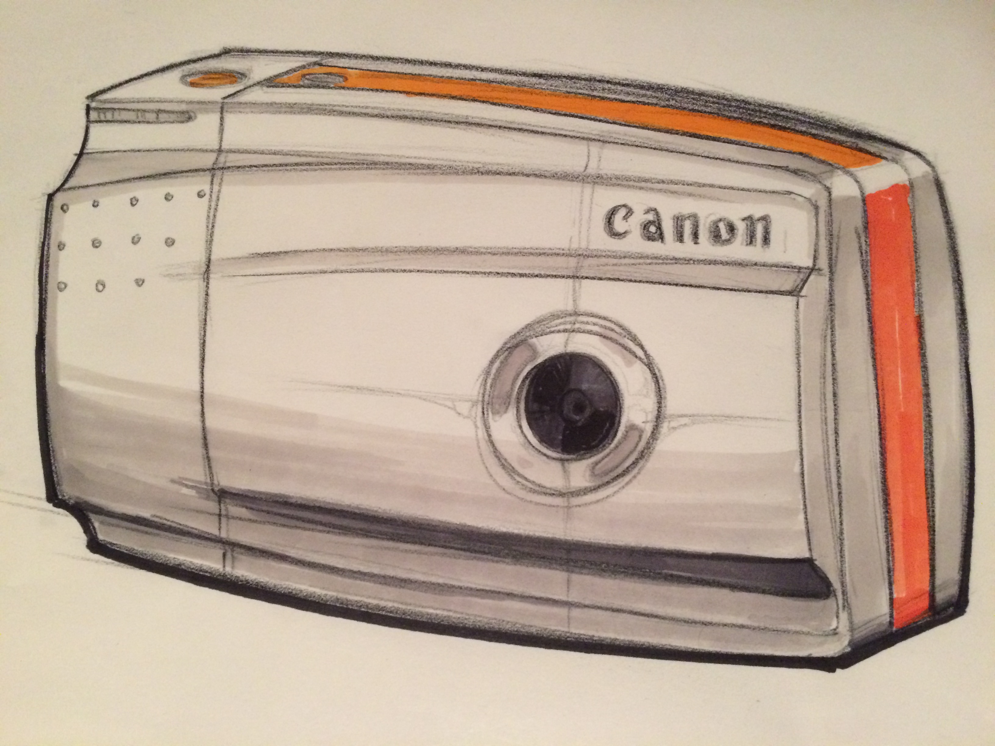
I took a pass at your concept. Things I changed:
linework, looser, more expressive, more dynamic perspective
light metal body, just a few strikes of cool grey 20% and 30% with a little bit of britany blue and cool grey 70%
lens, cool grey 70%, sharpie, and white pencil
back housing, orange, use marker lightly to get gradation
It is good to stick with a theme and explore within it for a bit. It forces you to build on your last sketch. I bet if you did 25 cameras in one week you would see a massive difference.
That last one looks much more fluid and fun! The very first one was a good sketch, but I wouldn’t worry so much about the shadows being a bit off (I hadn’t noticed until I read it!). I think bringing in some stronger grays into the contours would do a lot to make the cameras curved form pop from the page.
I personally find that a sketch that is too absolutely precise and accurate loses its ability to communicate well. It’s somehow much harder to look at ultra precise ideation sketches than loose ones for me.
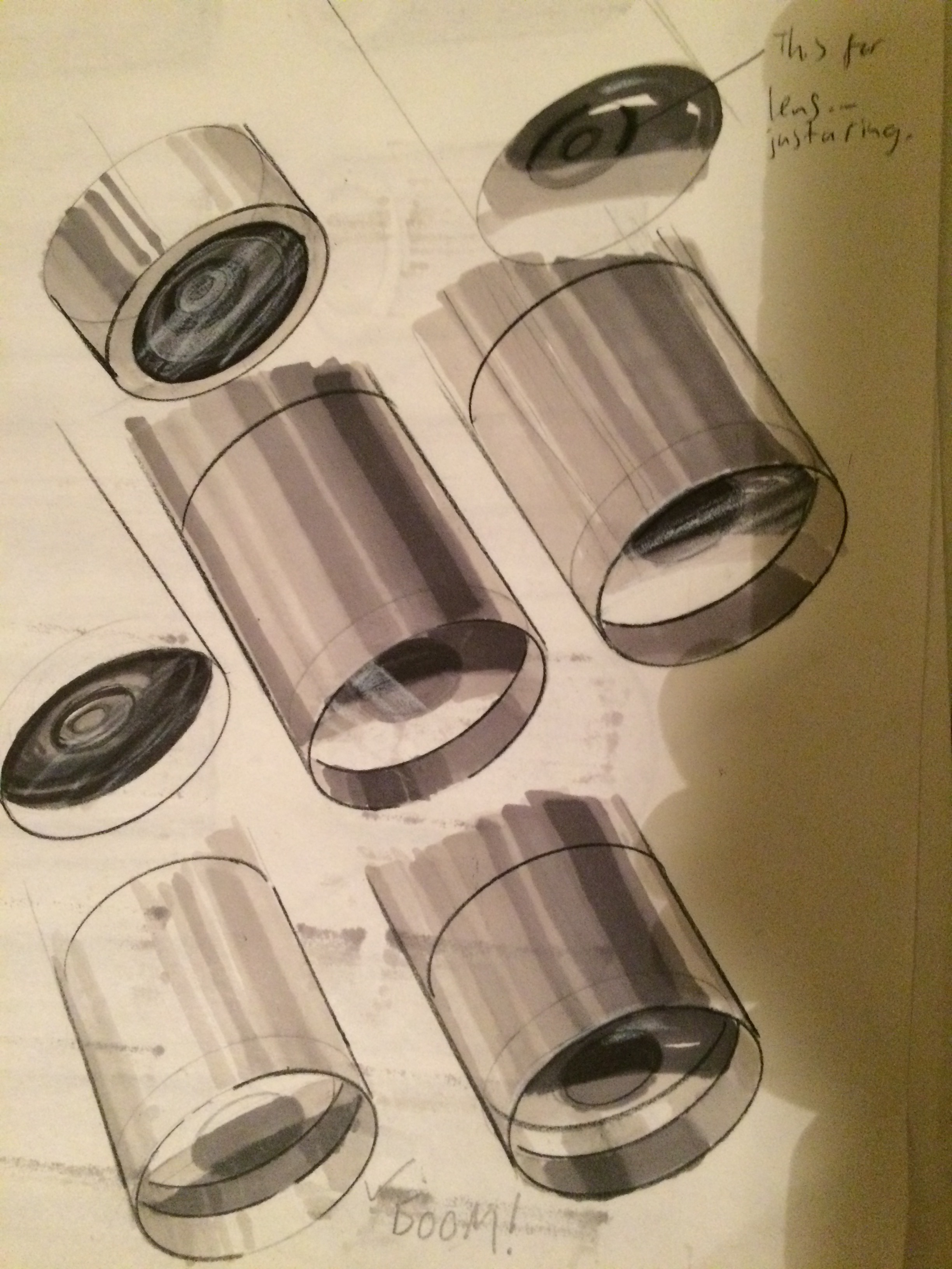
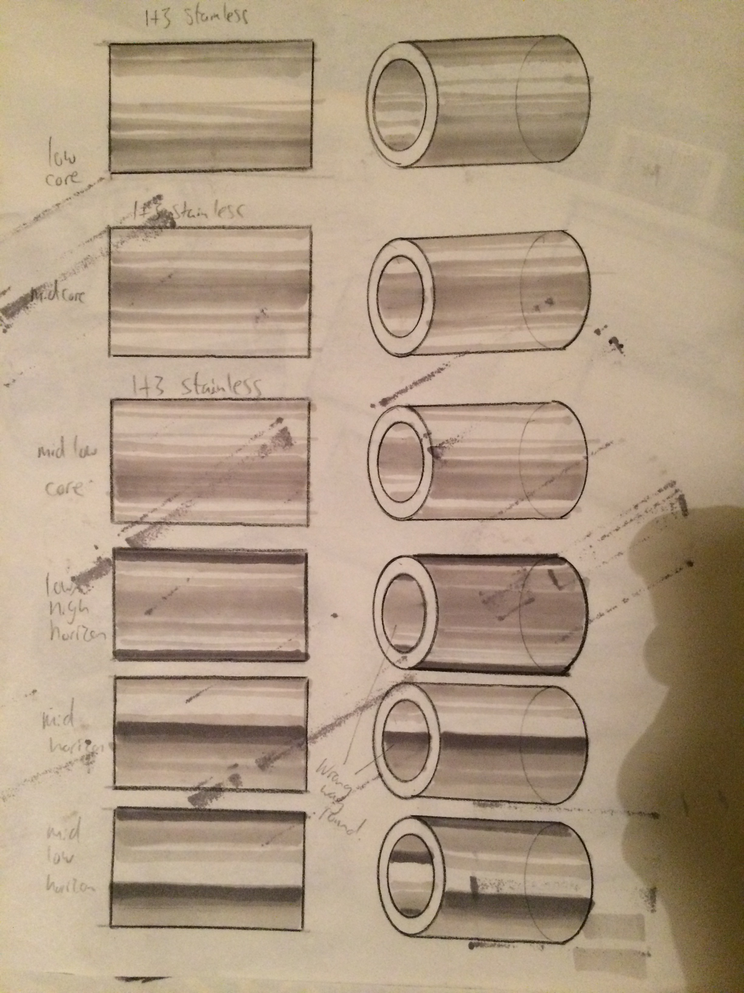
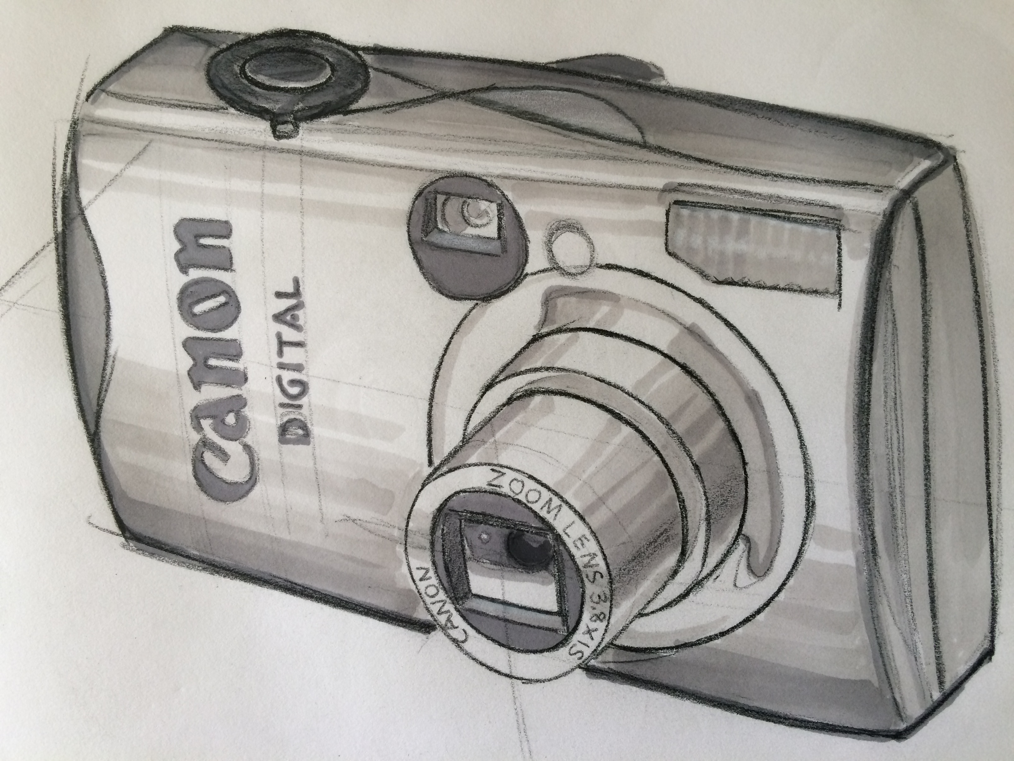
I tried a sketch of a canon but realised that the telescopic cylinder and lens is letting the overall sketch down. So i decided to practice this part on its own. Will do some more.
Those metal cylinders are starting to look pretty good! Especially the ones toward the bottom of the middle image. I always have a really hard time with chrome and glossy materials.
Hey Michael. I’m finding making clean swift lines on the cylinders almost impossible… But i’ll keep practising. Another thing if i get a line wrong then it screws up the whole sketch LOL. I guess that’s what underlays are for…
I did this before reading your last post… (own design)