Hi everyone! This is my first post after years of reading this incredible forum I just want to say thank you to all administrators, moderators, and the members of this community that make this board possible. This forum is a goldmine of high quality advice and information about ID and I’ve learned so much from you all!
Some background, I’m an engineer who has been out of school and working full time for 3 years in engineering. I have decided to give it my all to try to switch into a career in ID which is my true passion and have been practicing product design through 3d modelling, 3d printing, and sketching during my nights and weekends for the last 2 years.
I have started sketching every day for the past week or so since I really want to improve and will track my progress here. Here are a few sketches/renderings and some practice exercises I’ve tried. If anyone could provide me any feedback on where I can improve (I know there’s a lot) I would really appreciate it!
Welcome to Industrial Design. As you’ve probably learned, it takes a lot of hard work, practice and dedication to develop the required skills but the amount of tricks and creative energy you can bring to the table is undeniable. It’s a fun (challenging) ride. Glad you’ve started and aren’t afraid to share your work (this is the problem most beginners have).
I’ve been in your shoes (as most of us have) but if you continue to sketch daily and gather inspiration from masters of their craft you too will be able to communicate visually. If I were you I would go buy one of these books “Sketching the Basics”, “Sketching, Drawing Techniques for Product Designers” or “Design Sketching”. All excellent reads/examples of how to learn the fundamentals.
I would also check out of my fellow alumni, Reid Schlegel. His website on Behance has some great tutorials Behance On top of that his Instagram is loaded with top notch photo realistic renderings to give you inspiration.
As far as critiquing your work above I’d say:
You need to gain control of your pen more. Once you can sketch a single straight horizontal line, you can sketch anything.
Understand the principles of perspective. Vanishing points for 1 point, 2 point and 3 point perspective will help control those horizontal lines.
Know how line weight will affect the way one reads your drawings. This is crucial for making your drawings pop and understanding what is overlapping what.
These fundamentals are expressed in depth in all of the examples I listed.
Thanks so much for your inspiring and thoughtful message Pb!
I will definitely check those books out. I already have Design Sketching which has been a great reference and just received “How to Draw” by Scott Robertson today which I think should help a lot. I also have a used copies of “Design Rendering Techniques” by Dick Powell and “Creative Marker Techniques” by Yoshiharu Shimizu on the way.
I hadn’t seen Reid Schlegel’s work before but it is fantastic. His step by step sketching tutorials are really helpful. I’ll definitely check him out on instagram as well.
Thanks for the feedback on my sketches, I will concentrate on what you’ve mentioned and will get started on practicing my horizontal lines first.
I had a general question about straight lines, when drawing from the shoulder do you usually allow your sketching hand to glide across the page for support or do you only let the tip of the pen touch the paper?
Keno, thanks for clearing that up for me. I notice that for larger lines I was drawing straightest when I only had the tip of the pen make contact and by drawing very quickly. I wasn’t able to have much control by doing this for smaller detailed lines until letting the side of my pinky just barely touch the page like you suggested. This gave me more control to slow down and I noticed an improvement this morning when I was doing straight line exercises!
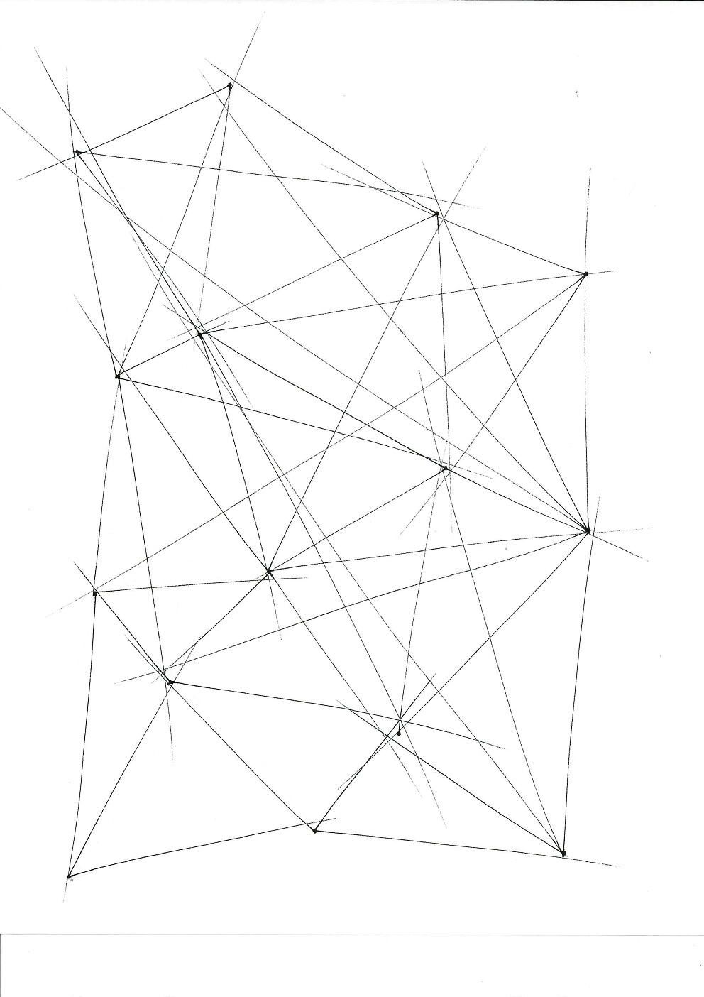
Here are some of the exercises I was working on this morning to improve the control and straightness of my lines. I’m going to keep going with this for the next several days to focus on improving my lines.
Every day for the last few weeks I’ve been reading and sketching along with the lessons in Scott Robertson’s How to Draw book, which has been a big help so far. On one hand I feel like I’m gaining more control with the pen but I also feel a little overwhelmed by the lessons in the book, especially with the constructions of 3d forms. Do most of you use a lot of construction when you’re sketching 3d forms? I don’t mind doing the constructions but they seem to really clutter up the drawing makes things confusing.
I think it might be nice to supplement this book with some of the others that were mentioned previously in the thread so I’ve just ordered ‘Sketching the Basics’. It seems like it has more basic lessons on constructing simple 3d geometric forms which I need more help with.
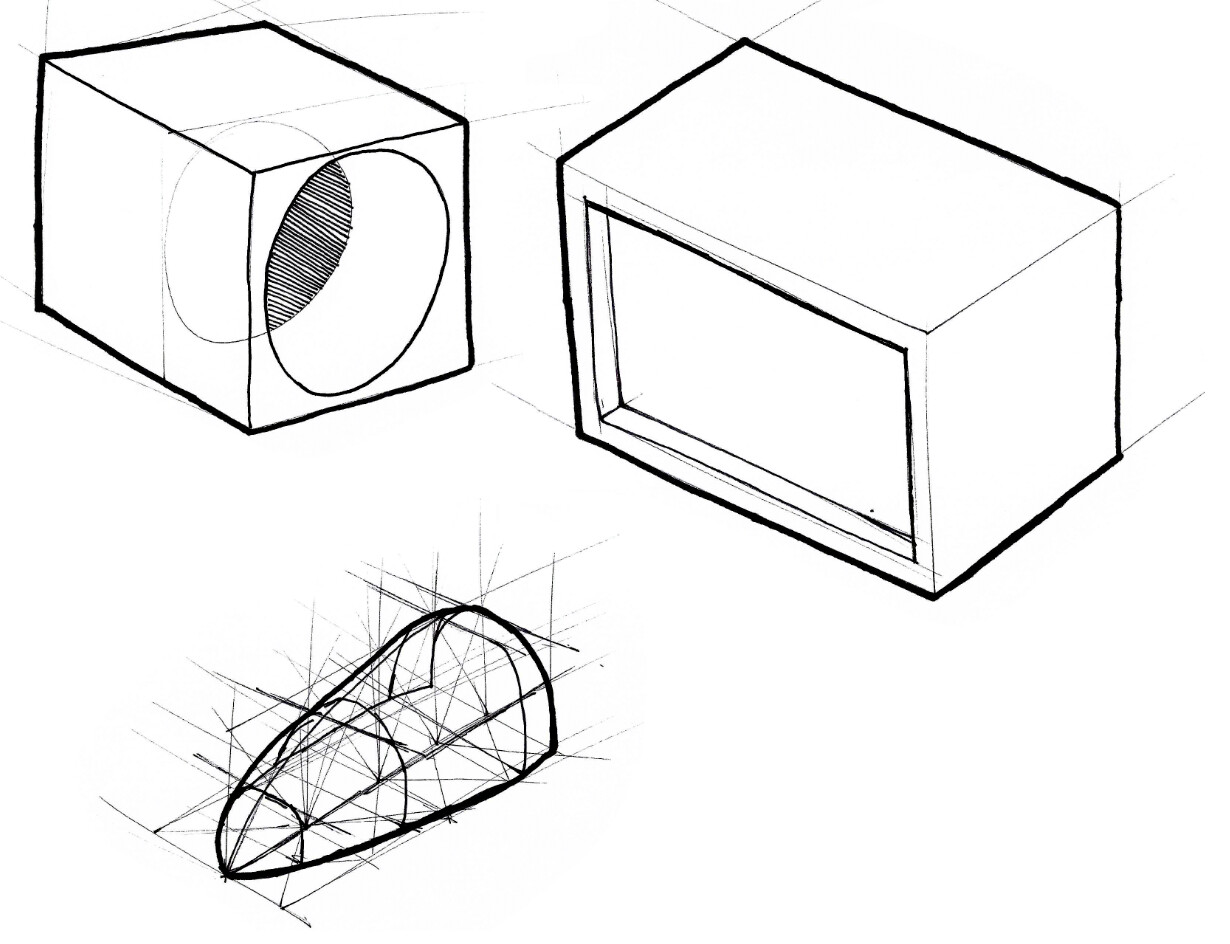
Here are a few of my latest sketches, nothing fancy but maybe they show a little better pen control. I’ve also really liked this uneven grid exercise which is helping me practice different ellipse degrees by trying to keep them between the lines.
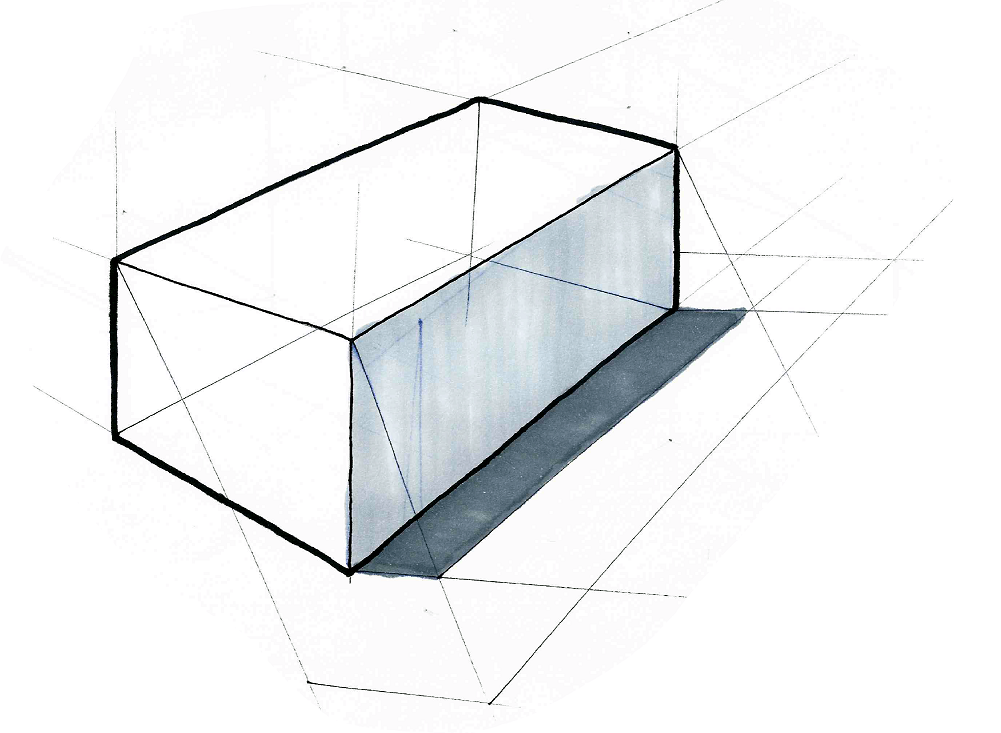
I’ve taken a break from ‘How to Draw’ and have been working through ‘Sketching the Basics’. In addition to being helpful for learning sketching, I’m finding that it has been helpful with understanding the design process through actual case study examples from different design studios. I was pleasantly surprised these were included! Also, I’ve realized that I was making the mistake of not having my lines converge enough in my sketches. I was doing more of a parallel line kind of thing.
Here’s an example of my latest cube, showing a little more convergence and also my first attempt at learning a proper shadowing technique as described in the book. The marker work got a little sloppy so I’ll have to work on that.
I had a line weight question for you guys. What materials do you use for your different line weights? Right now I’m using a Staedtler Triplus Fineliner for the initial sketch, a thicker black gel pen for the secondary/darker edges, and a fine point (normal round tapered tip) black sharpie for the outline of the object.
When I use the sharpie to outline my sketch things get a little wobbly and I’m wondering if my technique (slowly tracing along lines using my mainly my wrist) or my material is to blame.
I also struggled with that very question when I started out. So I’m glad you asked it!
I usually do a bit of both as Keno suggested. The less drag the better as to have a smoother line coming from your shoulder…however I like to have some support from my pinky to assure that I get the line weight consistency I am looking for. Proper line weight is HUGE.
Thanks Pb! I’m also finding that some support from the pinky is helpful.
I know I haven’t posted anything that is very complicated yet, but I’d love some feedback on my current line weight. I see that my closest to the viewer lines could be more faint, I just can’t seem to get the fineliner to draw lighter. Are there any other issues I’m missing? Thanks!
You’ll need to clean up your linework. This will come with practice but once you fix your linework it will look less “sloppy”…remember continuous lines are more appealing than short choppy ones. A “sketchy” or loose style is excellent, and great to strive for in early concept generation. However, you rarely see a loose style with definitive outlines…they kind of negate each other
When you sketch in perspective you are now drawing in 3D…so thickness matters. Your handle specifically on your kettle is actually one of those Impossible Shapes you learn about in Psychology …Where did the thickness from the top edge lead to? I’m assuming it should bent down the back edge and then back in on the bottom edge. Also, your buttons do not have any thickness…maybe they should be flush with the form? Even so, they would have parting lines which would have a darker line weight in the back than in the front. Little things like that go a LONG way in making your sketch make sense, thus giving it pop.
Thanks for the feedback Pb! That’s really helpful. Do you mean that with a loose sketch, the outer dark boarder is out of place? Would I only add the dark outline if I’m also planning on doing some basic marker color and shadow?
HA! I had a great laugh with your comment. I didn’t mean to M.C. Escher it! I was looking at it this morning when I finished it around 6:30am and I knew something was wrong but couldn’t put my finger on what. I guess I should make coffee BEFORE starting to sketch.
I’ll will do an overlay tomorrow morning and redo the pitcher and correct the things you’re mentioning.
Don’t get me wrong…you will still need to have dark edges in back to show depth and have proper lineweight. However, what I am referring to is that you should know what you’re trying to convey when you sketch.
Are you in the conceptual phase of design where loose sketches can benefit from inspiring new ideas…or are you sketching linework for a rendering underlay where you need to point out specifics in the products form or mechanical/material aspects. I wouldn’t do both. One is saying to the reader “I’m thinking something like this, but am open to changes.” the other is saying “This is how it is.” Which will drive clarity in meetings with clients/marketing/colleagues.
Here is an example of a loose ideation sketch that I am assuming was in the conceptual phase of design.
Ok so here’s a fixed version of the kettle sketch from yesterday. I was going to overlay my sketch, but I thought it would be better practice to redo it completely since had some dimensional things I wanted to fix. I went easier on the line weight of the outline and just used fineliner for this sketch instead of adding any sharpie.
Pb, thanks for the clarification. I see your point about how the purpose of the sketch drives the level of detail and techniques used. That’s something I wouldn’t have noticed before so thanks for pointing it out with your example.
I’ll work on defining the purpose of the sketch before starting. Learning about the purpose, process, and the different levels of visual communication is something I’ll work on.
For the record…you absolutely can have a heavy background line like a thick sharpie. This technique totally works (and is necessary for sketches at the more established ideation phase). It adds line weight depth to have your sketch pop. I originally got on this topic to encourage you to “clean up” your sketchy style if that was your intent.
Thanks yo! I hear what you’re saying. Thanks for the shot of motivation.
Here’s 22 kettles in 2 hours, 5 sheets of printer paper. I was shooting for a loose concept sketch style but I’m not sure how I did. I’m guessing I put too much detail in it and could have been looser so I’ll keep going! Either way I’m having a blast.