Hey guys, so I’m working on improving my drawing/marker skills. But they all seem to look a little childish or something, not quite sure where I’m off so if someone could point it out that’d be awesome. Is it my line weight?
I know I’m pretty poor at perspective, so I’m working on that as well.
I would concentrate on getting the perspective correct by sketching the basic building blocks of your sketches first. Having said that, the Space Station is pretty good perspective-wise, although the two vertical chimneys are a little off, and I think the marker work isn’t doing the overall image any favours.
I’d loosen up a little, leaving construction lines in a sketch isn’t a crime, and adds to a sketch’s “designer” feel. Be confident, draw straight lines from your elbow, curves from your wrist, and spin the paper so the line you’re trying to draw feels most comfortable.
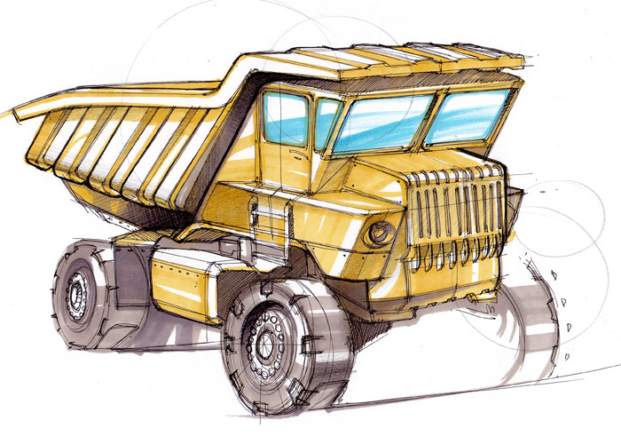
An understanding of perspective is important, but not the be all and end all of a sketch’s success. TBH, both near-side wheels of the Dump Truck aren’t sitting exactly as they should, but the overall look and feel of the sketch is unaffected.
There are definitely some perspective issues, the most apparent one to me is the tabletop stove. The back edge is sitting flat, but the front edge is clawing at the table because it’s not going to the left vanishing point. I also think that the environment backgrounds you are sketching around your main object are clashing with the style you are trying to achieve. That stove would look much better if you left out the pots and pans and rendered the top with marker and maybe added a vignette behind it (but totally not necessary). I think this will drastically improve the way your sketches appear because they aren’t too far off.
The only other thing is your line weight is pretty shaky! loosen up!
That’s awesome! Thanks for the feedback guys, this is the reason why I love these boards. And Sam, I’m glad you say that about the space ship because the bottom two were from a couple months ago and the space ship was done yesterday and I’ve been working on my perspective, so it’s definitely been getting better.
And apowers, I’ll give being really loose a go, I have a real difficult time with it right now, but I want to see if that helps and also thanks for the advice about the backgrounds!
Phone sketch from today, focusing on perspective, it was loose until the page looked nice then I got tight and the bottom right corner, the last sketch is a little off.
Ditch the markers for a few weeks and focus on line quality and weight. Get your perspective dialed in better and be more deliberate with your mark making. Straight lines should be straight and curves should be curved. You’re swinging your arm on your elbow and everything has the same slightly bent line character.
But line quality is the main issue. Single line weight images filled in with flat color end up looking like animation cells, cartoony as you said.
I agree about focusing on the lines for now … but don’t necessarily only use ballpoint or other pens.Some people do great with ballpoints but I have trouble because you have to go over the lines a lot before you can get any real lineweights. It’s also very hard to make curves / ellipses bolder without getting super hairy. A lot of people recommend doing linework exercises with standard Sharpie – it makes you commit to each line (and can be very fast). Markers can be great for linework alone.
If you see Jeff Smith’s (Concept Sketches - Linework - Single concept per page by Jeff Smith at Coroflot.com) stuff like the image below, you can imagine how quick it can be … IMO quicker but cleaner than you could do with a ballpoint in the same amount of time. You can also get the same effect with felt-tips pens or even cheap-o Crayola Supertips (though they might bleed if you shade later).
A lot of it might be how you’re treating edges, corners, groupings and material faces - take a look at real objects mimic’ing the feel you’re going for and duplicate some of what you see on a few sketches, you’ll find that a light hand in those areas will help sell the idea and take out some of that cartoon’y look you wondered about.
good, good, keep going. Try making lines that denote the perimeter a little thicker and darker. Any line you can “tuck your hand behind”. Also, try making your cross hatches a little closer together/more of them and let them go slightly beyond the perimeter of the shadows line (note Jeff;s sketch above with that. Let your lines go past where they intersect with other lines. Lastly, try incorporating some thick to thin lines. The thick to thins really draw the eye into the sketch.
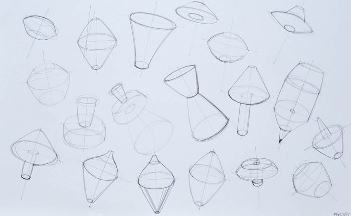
It’s great to be ambitious in your subject matter as you’ll do better work drawing something you are excited about as opposed to something you find mundane or tedious. But having said that, don’t knock the value of just sketching very simple shapes - Cubes, Cylinders, Spheres, etc.
Taking a little time at the beginning of your sketch session to bust out a few simple objects can help get you in sketch mode by letting you focus on the style of the drawing rather than the subject matter.
Theres no shame in going back to basics once in a while.


