Well, after getting some encouragement to post my sketches on core, I started this thread. I’ll probably update it sporadically based on what I’m doing, but any feedback would be greatly appreciated. Just a little background- I am a sophomore in my second quarter of ID (Our first year is fine arts drawing and design foundations) at DAAP.
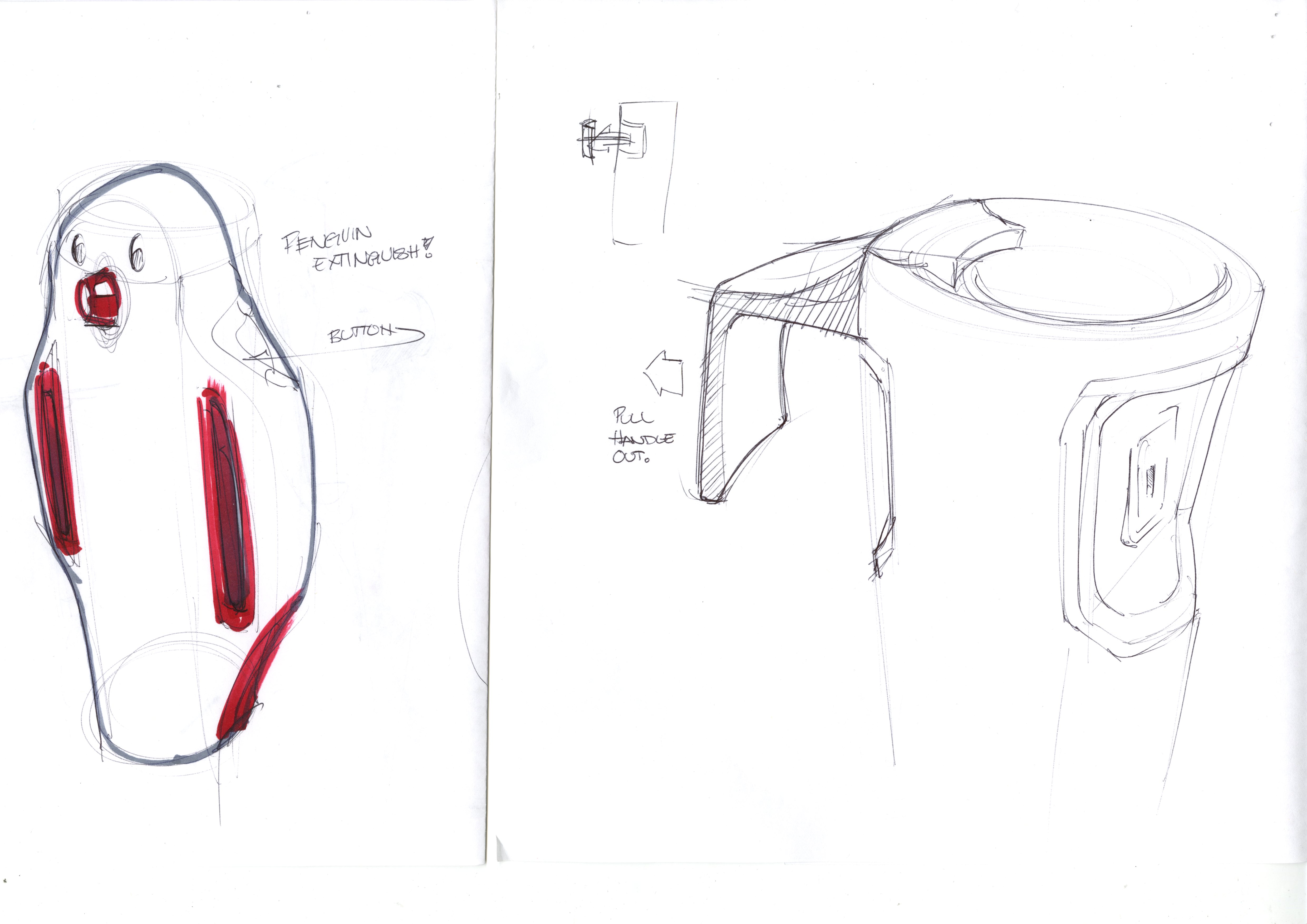
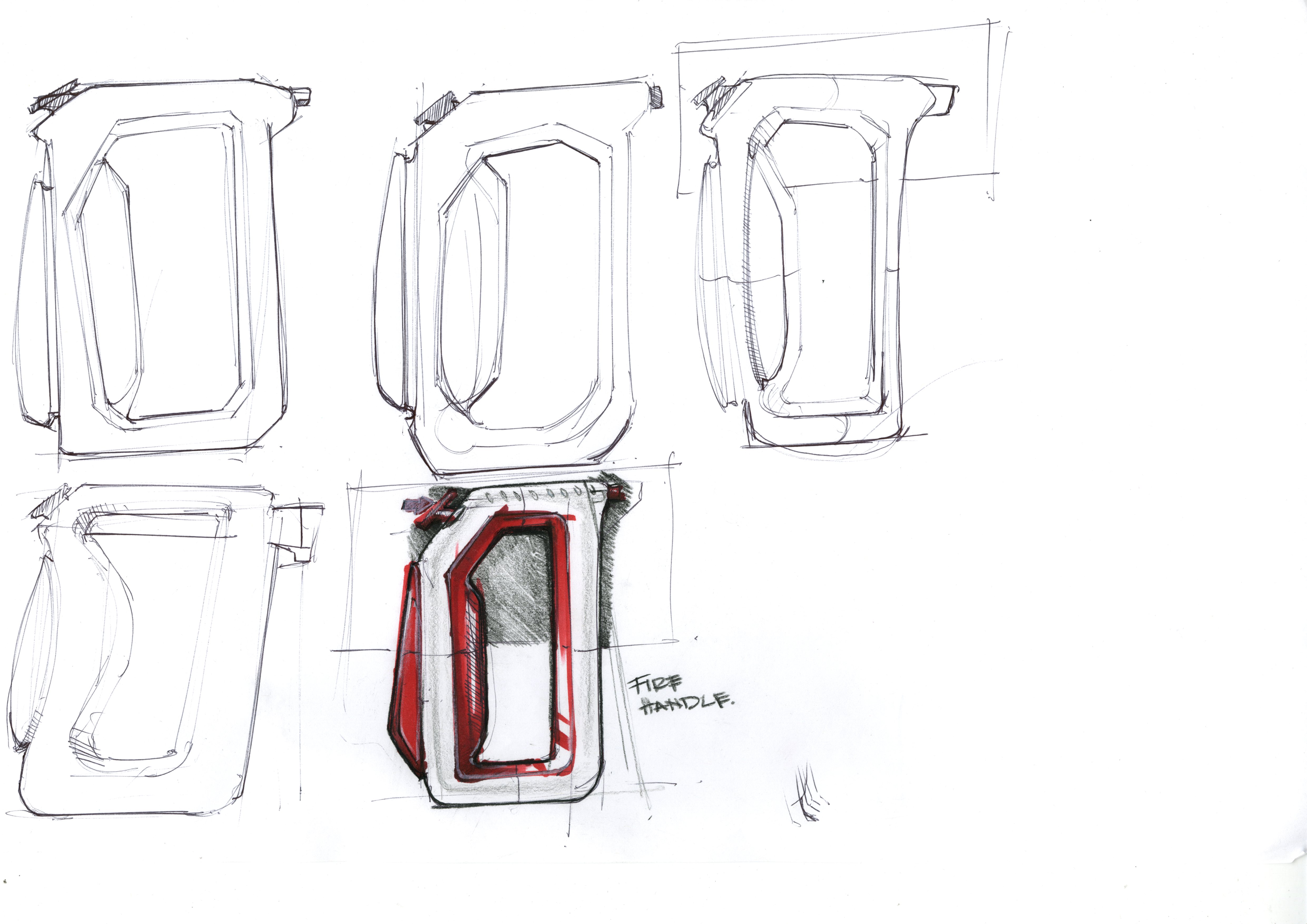
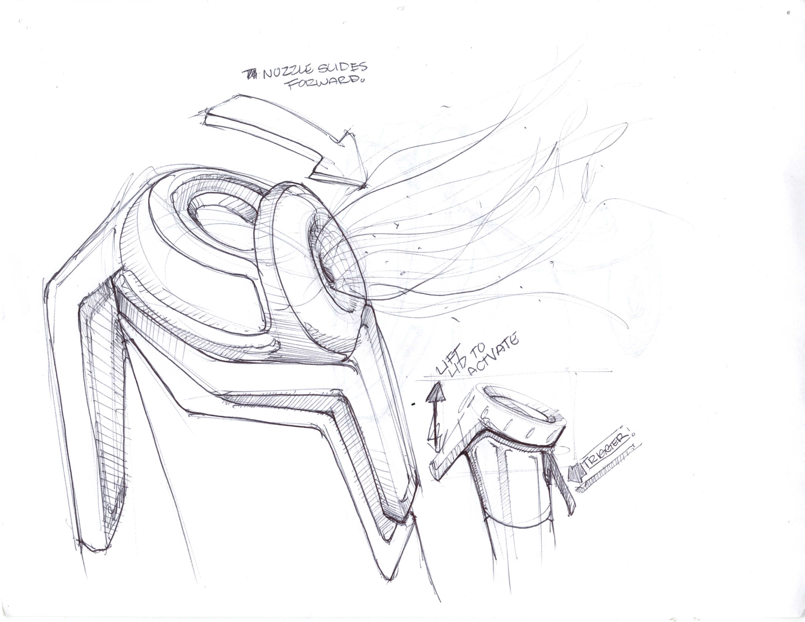
I’ll start by posting some sketches of my current project, a kitchen fire extinguisher. This is for our sophomore “ergonomic hand tool” project.
It as great to meet you at UC this week Jonathan. I’m glad to see you posted your work, as promised I will take a look at the portfolio you posted in the folio forum. Also, I was pumped that you brought my book to sign! That was cool for me.
Your black and white sketches seem a bit bolder to me, a little more free. I would focus on this and then use color sparingly at first, to communicate function. By this I mean use color to draw the eye to certain features and thoughts in the sketch. Work on varying your line weights, really push the contrast. Sometimes it helps to sketch with several thicknesses of pen. Sketching with a sharpie for awhile will cure timidity on the page for sure.
A trick that helped me when I started is i would take a linework sketch to a point I felt good about it, then I would photocopy it 4 or 5 times and try to push it in different ways, adding contrast, color, and value… it removed the feeling that I would screw it up. Give something like that a try. Scanning it could do the same thing.
Q4857- I will definitely do that for my next sketches… Though for now, I’m mostly done with the sketch process with this project. That’s definitely something to keep in mind for future projects.
Yo- It was nice to meet you too! I had a great time listening to your stories and the whole event was pretty inspirational.
Anyways, I’ve been practicing marker for a little while now, and the idea to just photocopy a sketch never occurred to me- that will definitely help overcome the fear of ruining a sketch. I think for me, I just need to keep practicing my markers until I can control the values a little better before it goes kind of wild and ruins a sketch.
Thank you both for your feedback! I’ve added two sketch composites for this project, one on the activation mechanism (instead of a pin) and the other on the launch mechanism. One thing I know I need help with is laying these pages out- I feel like I’m just cramming all my sketches into two pages, and the end result is this sort of sketch vomit… Any tips?
This is a des com project i just wrapped up- we make up a product and render out a composition. I usually do something kind of toungue-in-cheek, as for sophomore year, this class is more about the technical skill then the final concept itself. Hence, the banana phone, cell phone edition:
Question: are handwritten call outs more appropriate then font based? Also, in terms of the OS sample, should that be a little more mechanical (e.g. done in illustrator), or is a quick wireframe better for this presentation? And finally, any tips on rendering? I’ve had a lot of trouble with photoshop rendering this quarter, and maybe I’m just missing something… haha