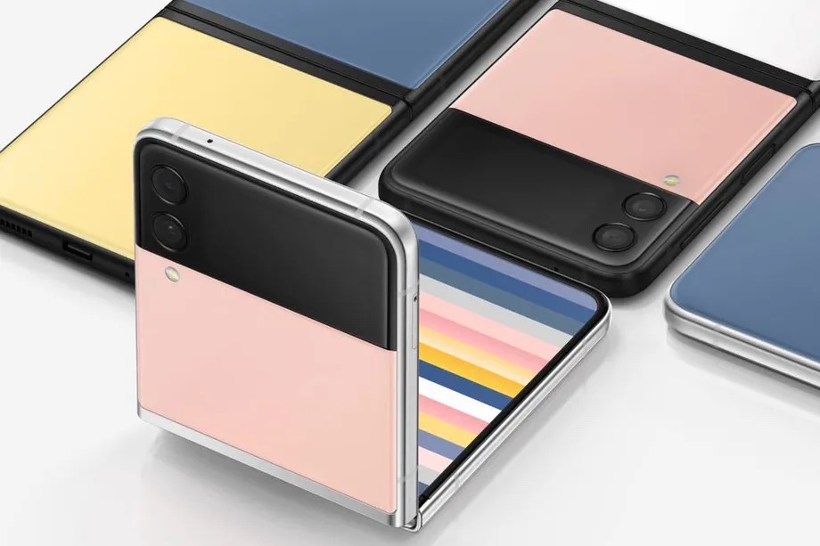
I am loving the restrained playfulness of these. The black band on the back makes them immediately recognizable and differentiated from the iPhone while not fighting the smartphone archetype. Some sophisticated CMF work as well with the nice two tone options.


At least it won’t rock when you put it back down on a flat surface unlike the iPhone. I wonder how beat up that bar is going to look after some use though and if it might be annoying trying to get in/out of a pocket? The two tone is nice - would be cool if it was customizable somehow.
R
Feels like it would fit perfectly in a 60’s engineers shirt pocket. “Pocket protector style” That aside I am huge fan of tonal treatment on the back. Super smart! Maybe I am just a sucker for symmetry however it feels like the sharp edge on the camera “bezel?” aka black bar would have been a nice detail to pick up at the top and bottom of the phone…
It does have a bit of a 1960s feel to it. In a good way. The narrow bands of warm toned metal and colors remind me of some of the appliances in some of the original 50s and 60s homes in my neighborhood. We toured one a few months ago from 1953 that had all of the original appliances.

That Pixel 6 is also IMO a good physical execution of a restrained Material Design aesthetic/architecture.
What?
R
I’m in the same camp as designbreathing.
It probably looked great as a sketch.
Give me a technoprogressive AI/robot aesthetic anytime over this.
I wish the pink didn’t look like the 50’s bathroom porcelain tile, sink, and toilet that used to be in my house. Looked like this:

That’s what I see, even though I do like the aesthetic. The color choices are pretty ballsy.
That’s why I like it ![]()
R
I’m gonna have to be on Team Richard for this one.
Yes, individuals have color (& design for that matter) baggage. It is well documented and books have been written about it (John Dewey). My advice for you folks is to get over it. For the rest of us folks, I am happy to the variations of white/black/metallic flake coming to an end. Nice to see it in cars and personal electronics.
LOL. Over it.
I think it’s an OK design. I’m glad to see someone finally create some kind of a place to hold on to your phone without a case. I went case-less for about a month with my phone before I had dropped it enough times to realize I needed a giant rubber condom around it.
If these back panels are PC, I’m all in. I don’t understand what kind of moron decided glass on two sides of a hand held object was a good idea…
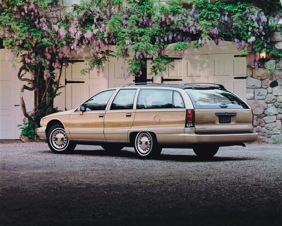
One more thing… I’m looking for a new car and actually had the thought, “man, it would be nice to be back in the days when you could get a Caprice wagon.” This is how desperate I am for car makers to make cars and especially wagons again.
