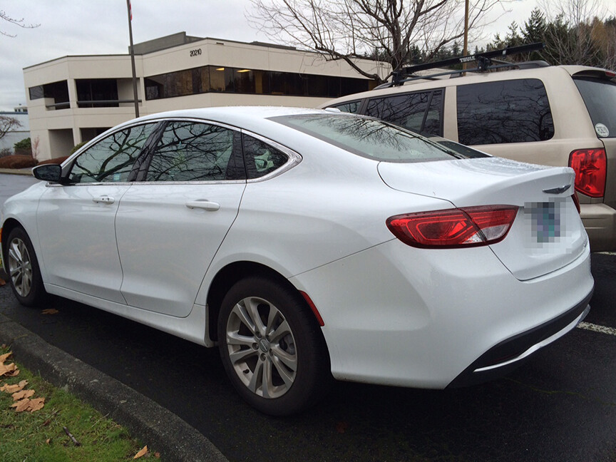
There is some fresh surface language happening in some new Dodge and Chrysler models, including the Dart, 200, and even in the Durango. The silhouettes of these models haven’t changed much - like in the Charger - but the surface transitions are a lot more well considered and flowing throughout. There’s a consistent language around the exterior and even into the dash.
I don’t have a trans background, just noticed that there’s something different and more attractive with some of these hunks of sheet metal. Doesn’t mean I’d buy one.
What are they doing differently? Has there been a changing of the guard at the upper design levels? Keep it up…
It is the Fiat ownership. in most cases the same designers, but they are being allowed to do their thing and getting better platforms to work off of. The 200 is a Fiat based platform, lower, longer, wider, wheels at the corners. Get that and you have a good canvas to start with and then a CEO that values more emotional design, and good things happen.
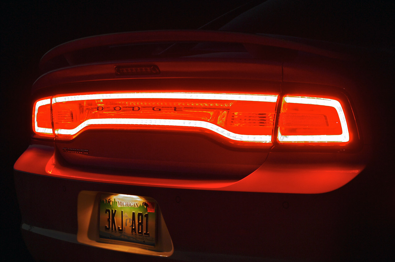
The back end of the Durango is pretty dang nice in my opinion and has a great connection to the Dart, Challenge, and Charger.
Mention the Dart to most car-enthusiast people and you’ll get a puzzled or disdainful look, but this front corner is executed so much better than previous Dodge/Chrysler models. The glossy black combined with the lamps remind me of the BMW i3 rear hatch, and there’s good attention to the line work and part breaks. In this photo the hood closure doesn’t appear consistent but maybe that’s just the low angle.
Huh. Guess I’m both a) not up on my car logo history, and b) too young? But apparently that logo was used by Dodge previously, and is called “Fratzog”.
The first time I saw that logo on a soldiers car over here as a kid I thought it was an aerial view of a posh mansion with 3 quarters and a gathering spot in the middle. Something James Bond lairy.
Would be fun to build it for Dodge on a hilltop near Palm Springs.