Everyone is constantly trying to improve their rendering/sketching abilities to create photorealistic renderings. I thought it would be great to have a thread dedicated to gaining tips and tricks on how to improve in categories of realistic/dynamic/exciting. Post your work and help improve others!
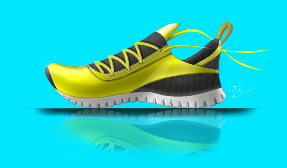
Modern Man’s primary advise is you need to begin by understanding the fundamentals of viscom. For example, the highlight on the tongue of your shoe indicates that the light source is from above which means your highlights and shadows on your laces are flipped from how they should be.
I agree the highlights are off on the shoe laces, but I have my light source from the top left so some shadow should be on the back side…probably just more so and tipped off a bit. I think that will help!
What bugs me a bit is that the ground shadow and reflections aren’t lining up. I’d think you should only see one shadow, not two.
I’d make the shoe float completely, i.e. detach it from the shadow or put it straight onto the surface. Right now it seems as if you are trying a little bit of both.
Also an inner glow might help this sneaker pop a bit more.
Personal pet-peeve: H-U-G-E signatures on basic doodles… I always think it looks a little silly. But that’s just my opinion.
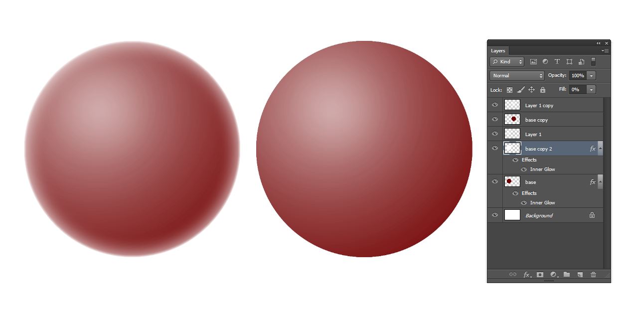
I wish I knew about the inner glow (and all the Photoshop effects) way before I learned them. If you double-click on a layer, you get the layer effects window in the second image example below, and you can add any of those effects. You can apply this to a visible layer or you can stack them by having the fill be 0% (the effect still comes through). This way, the ball on the left feels less flat, and you don’t have to carefully draw this highlight around the perimeter of the whole object.
I knew about the photoshop inner glow but the shoe I rendered was in sketchbook pro so I wasn’t sure if that would be different. I guess I could airbrush the perimeters?
The rendering is looking pretty good PJ but the proportions and design lines are holding it back right now. I’d go back to the sketch stage and really work on the proportions. A few things that look off to me: toe spring is much to high and round. Arch is too far forward. Heel is collapsing vs being full the way it would be with a heel counter. Eyebrow is falling to the side of the shoe.
sorry, autocorrect: eye-row, where the laces pass through the upper. It is falling a little too much over the side unless you intend the laces to be asymmetrical or very low and wide.
hi, I think your solid color background is making the shoe look flat, as a suggestion, try putting a graduated tone top to bottom or in a defined box behind the shoe. This might give it a bit more ‘pop’. PT