Hello everyone. I wanted to share with you guys a personal project I’ve been working on.
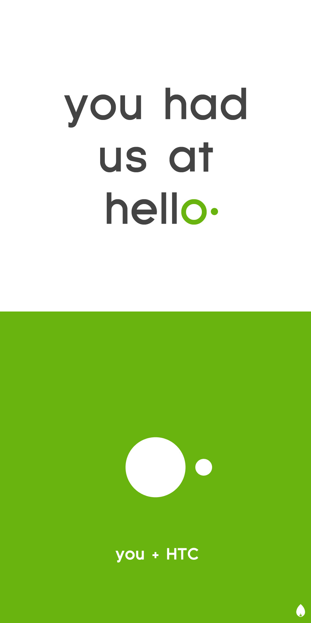
Following in the footsteps of Andrew Kim’s The next Microsoft project, I decided to experiment with branding and UI design. I chose HTC - a company I deeply admire and respect for their meticulous attention to detail and fearless approach to mobile design. However, I’ve noticed that they began to forget their mission: putting people at the center.
For this project, I took on HTC’s brand image, as well as making over Sense and Android to better align with Google’s current design language.
I hope you all enjoy this project as much as I enjoyed making it! Please let me know what you guys think. Thanks for reading!
* Please note that this is a personal project, and does not reflect the views of HTC.
I think the graphics are strong and clear, both for the slides and the UI screens you’ve made. It also seems to fit well with google’s current style, but from a brand perspective this is something to consider. Is there a risk of being perceived as yet another google-phone and not something unique to HTC. My impression is that handset makers are trying to avoid getting into the “Windows trap”: none of the pc makers seem to offer something really unique so they’re all just competing on price and specs.
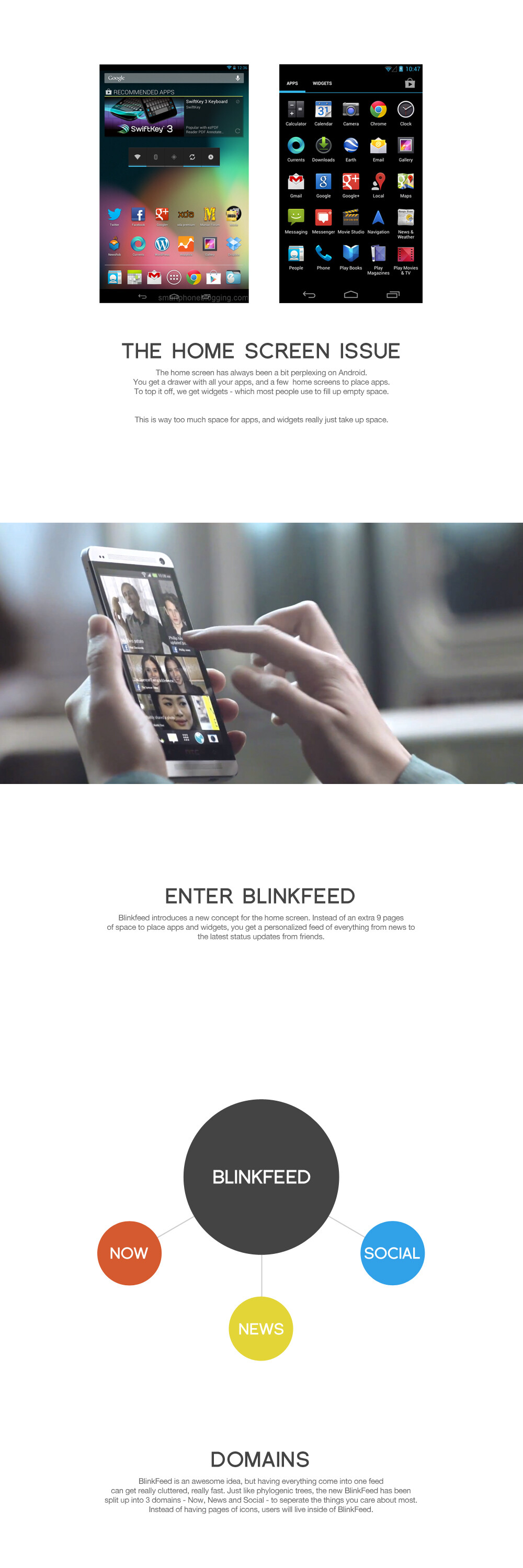
The idea with the three screens showing information like collages around three different themes is good (news, social and now). Seems to be an good way to get an overview with some filtering.
Things I would consider:
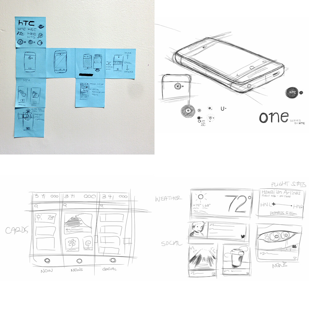
The sketches. Tighten them up a bit, but more importantly focus on telling a story with them. At the moment they seem more like “thinking sketches” and they probably remind you of what you thought when sketching them, but lack something for me as a viewer. For instance, how do I go from “Now” to “News”? I’m guessing by swiping, but I’m not sure. What happens if I press a “content box”? It expands? A new app (change of screen) opens?.. The transitions between states are also important for the experience and understanding of the system.
The lock-screen. For me an arrow pointing down at the edge of the screen does not indicate swipe down, but swipe up to drag up what is below the edge. So the Unlock and “Get to camera” swipes are counter-intuitive to me (and I feel break what has become a convention on touch screens).
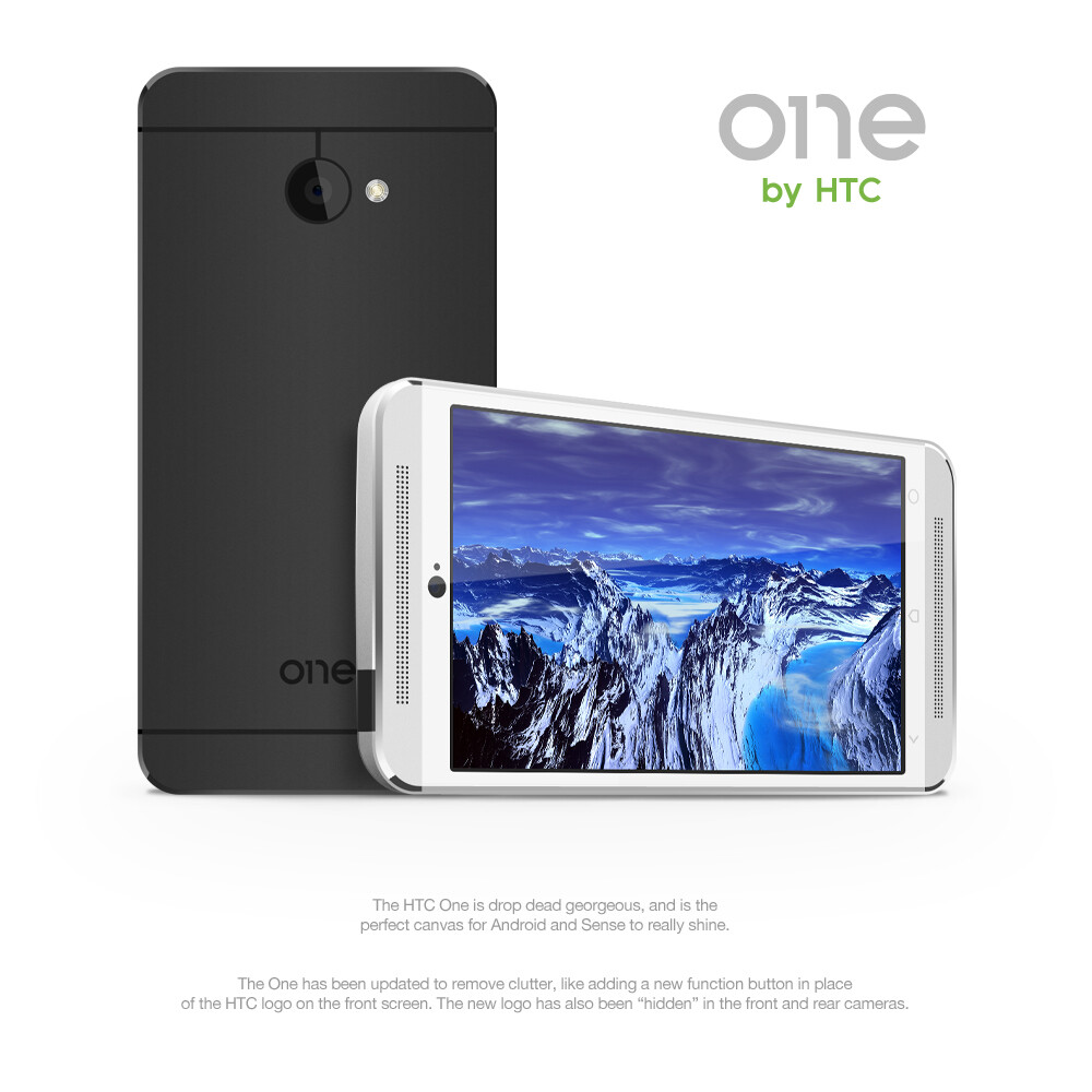
The logo. IT works as a graphical element and the story makes sense, but: if I like look at the back of my phone the small circle/big circle is there as well (+ an apple). It doesn’t seem unique enough for HTC as many phone have this lens/flash configuration.
The packaging. A nice idea, but it seems to fragile for transport/shipping. Make it work and it is cool. For now it leaves me wondering.
The Dock. I’m not an android user so I could be misunderstanding. You have a circle in the middle of the dock and there is a touch button on the phone also with a circle as an icon. If these both do the same, do you need both?
Hope some of this is useful for you. Seems like a fun project to do and makes me want to do something similar just for the exercise. I don’t get to do much UI/UX design.
Edit: (I start by saying “a few quick thoughts” and end up with “a book” )
No worries Jada, I really appreciate long replies like yours!
So to answer a few of your thoughts:
I will work on them, I do admit I do not sketch as much as I would like…
The logo was something I wanted to disappear into the phone, something that wasn’t immediately obvious. I feel that there’s typically too much branding on phones, so in this way, it serves a purpose as well – but I totally understand that other phones have this configuration as well.
The circle in the dock will take you to the app drawer, the circle touch button will serve as a function button – you can designate what it does (open multi-tasker, launch camera, open settings, etc.) – sorry for making this unclear in the presentation!
Thanks for your response, it’s always helpful to get feedback on how to improve! I really enjoyed making this project, and it really gave me a great platform to tinker with UI design. I encourage you do something similar as well!
The new design seems to have no place for apps, and is entirely “widgets” which seems to conflict with your statement: “this is way too much space for apps, and widgets really just take up space.” The app drawer isn’t a great app launcher, it’s just holds all your apps and isn’t something designed to interactive with all the time on your phone unlike the homescreen. We use apps more than anything else on the phone, so I’d like to see you address that here as well.
I’d suggest you show a direct comparison of their products proving the “darkness of Android” vs. the “bright/minimal” of their brand language. Compare web gmail vs. iOS gmail vs. Android gmail (or any other google app/product).
It’d be great to seem some motion in the presentation. Even a simple gifs just to show how you switch between social/news/now. I think your take on blinkfeed makes a lot of sense compared to the current product (bad pun intended).
If HTC is focusing on putting people at the center, why are all the brand advertisements glorifying the mark and device and not centered around people? The mountain, atom, billboards all don’t seem to align with the message you’re trying to create. I think HTC nailed it with this commercial:
I chose to remove the traditional ‘home screen’ with an expanded blink feed. You are most certainly right, most people live in apps, so having a central place to launch them is really all that is needed. Why have a drawer with all your apps, and 9 extra pages to throw duplicate shortcuts, with interactive widgets to take up additional space? That’s what I wanted to tackle, because to me, it kinda seems like a waste of space. Just have full screen, immersive ‘widgets’, and a drawer of all the apps.
I’ll work on some comparison slides. I suppose ‘dark’ wasnt the best choice of words!
I’m not experienced in creating .GIF’s, but I will look into it. I know how to use Ater Effects to an extent, and I believe there may be an option to export .GIF files. If you have any suggestions or tips, I’d love to learn more bout it!
The ad examples do indeed focus on the new logo - mostly as an illustration of the logo in use. I’m sorry the slides were unclear!
I really love the ‘You’ ad campaign, and reminds me of an HTC that really put a lot of love into everything they made. I hope they can get back to this mentality.
I think my main point about the app drawer is that it is a poor experience to launch apps from. Sorting through apps alphabetically is a pain when you have pages of apps (I have 7). There are launchers that allow you to sort into folders and other fun add-one, but I think you could do something with the app drawer beyond its normal function. Just a thought.
In terms of GIFs I’ve had luck making them in photoshop. You can use the animation window (Window>Animation) and import the layers of the files as frames. You don’t get a lot of control, but it would allow you to possibly rough out some of those ideas in motion. After Effects would work as well, just more complicated with greater control. I’d love to hear others suggestions as well on how to do this.
Your ad slides were clear, I was just suggesting adding more human presence in them for a brand that is all about “you”.